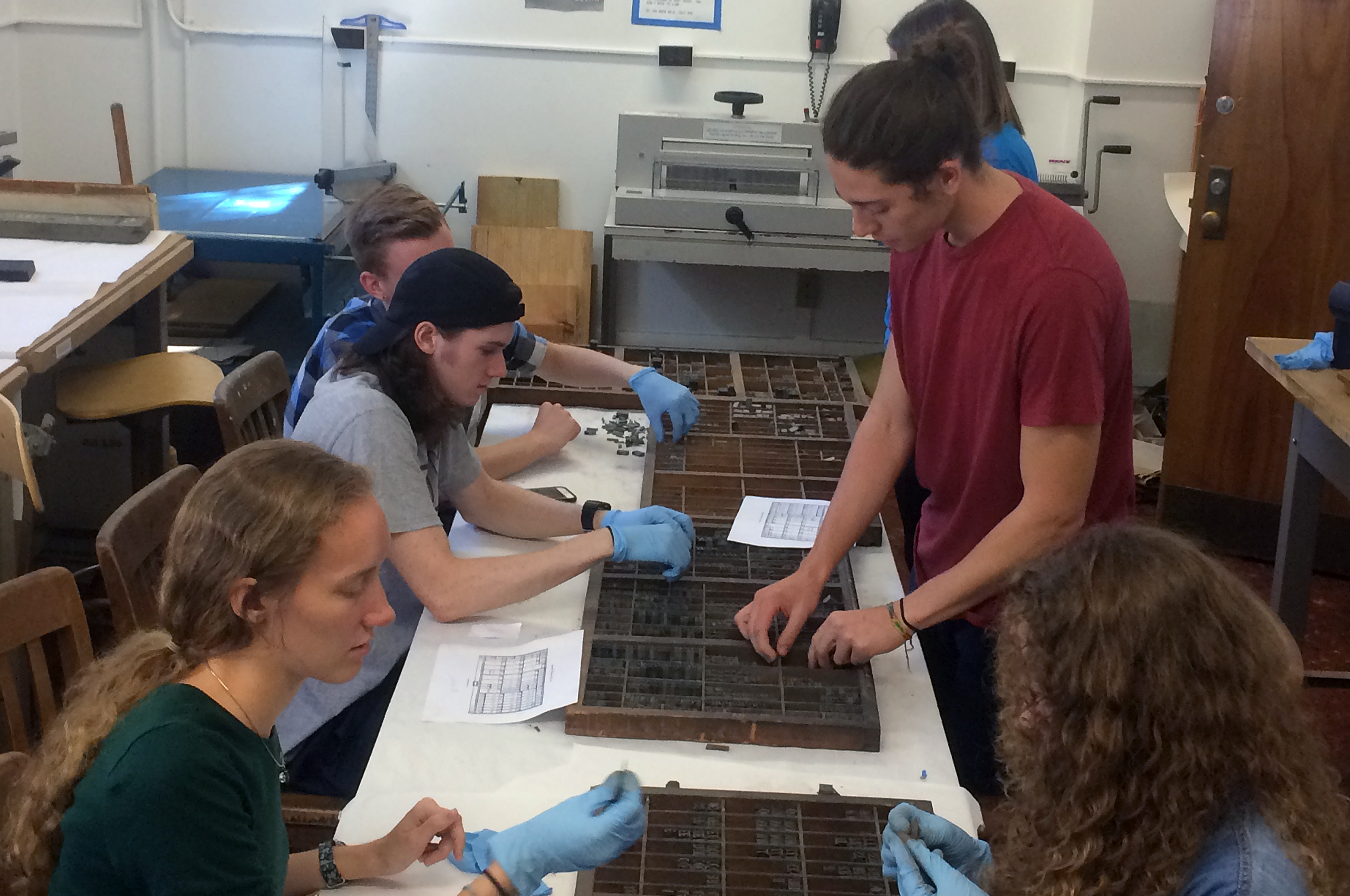
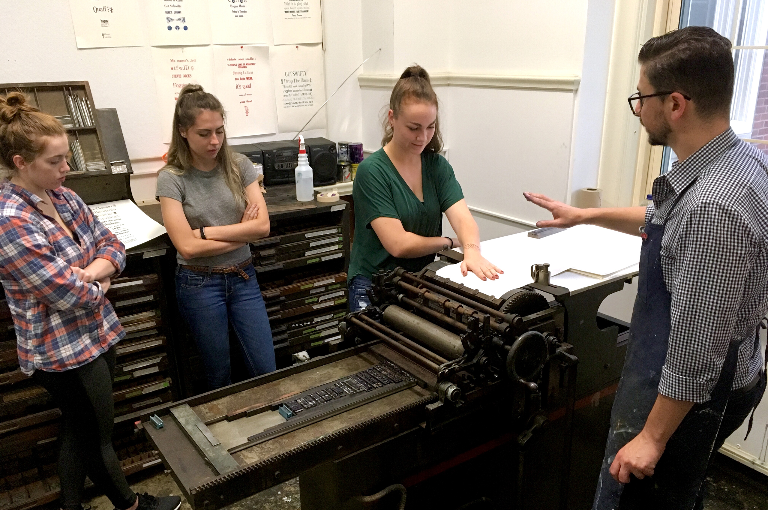
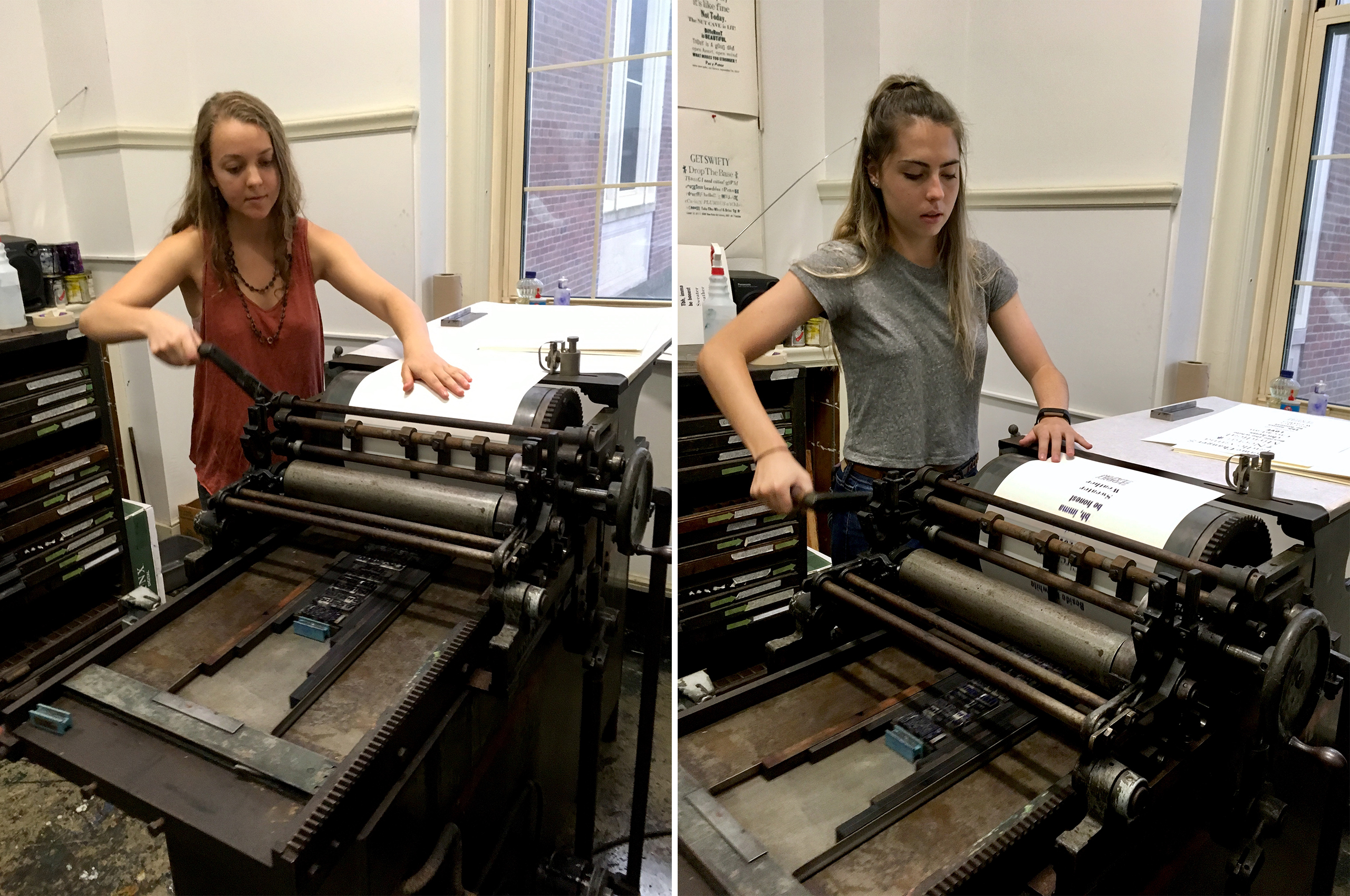
Project: Letterpress Workshop
Class: Typography
Students sort metal type, typeset and letterpress a broadsheet.
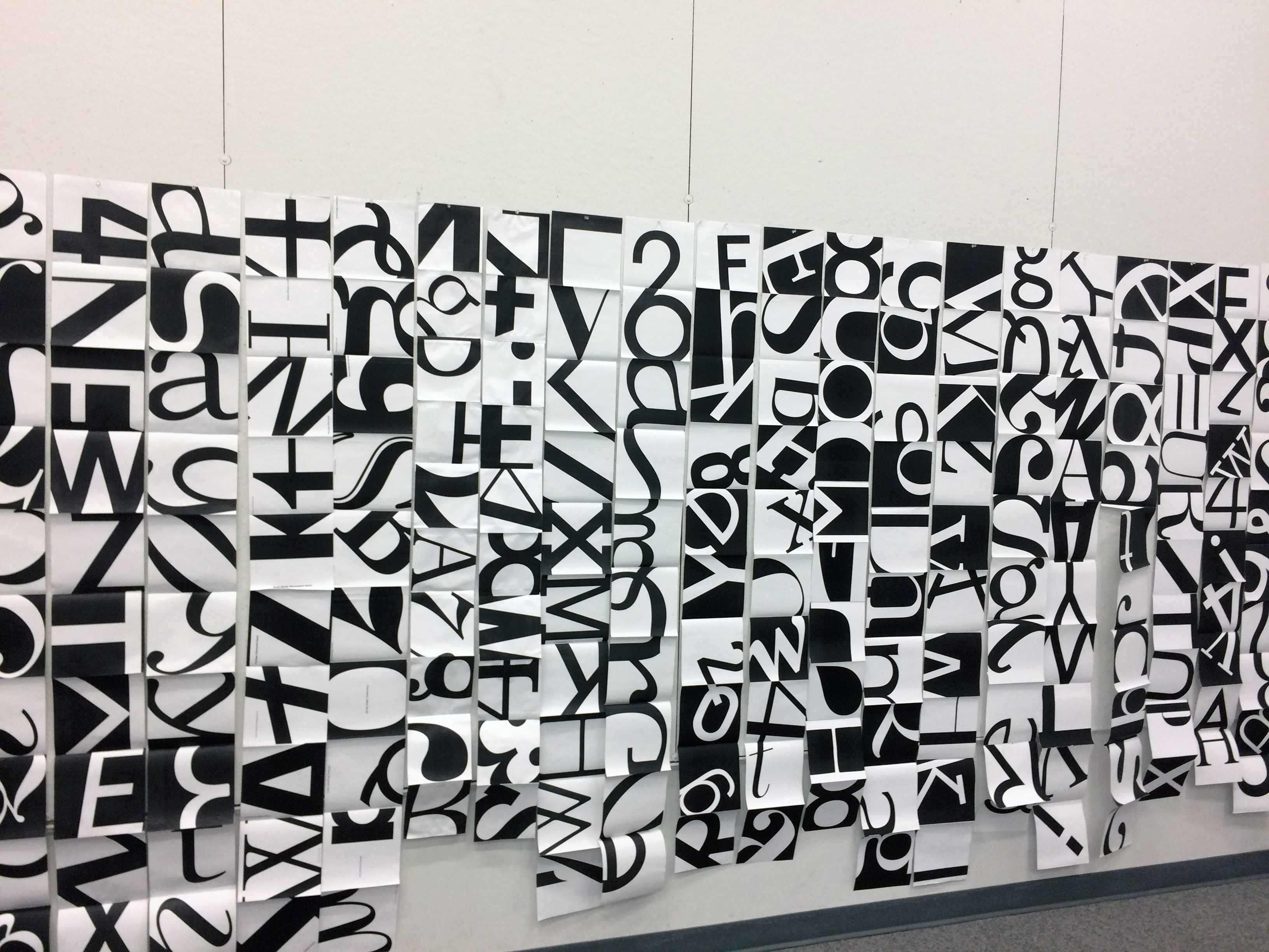
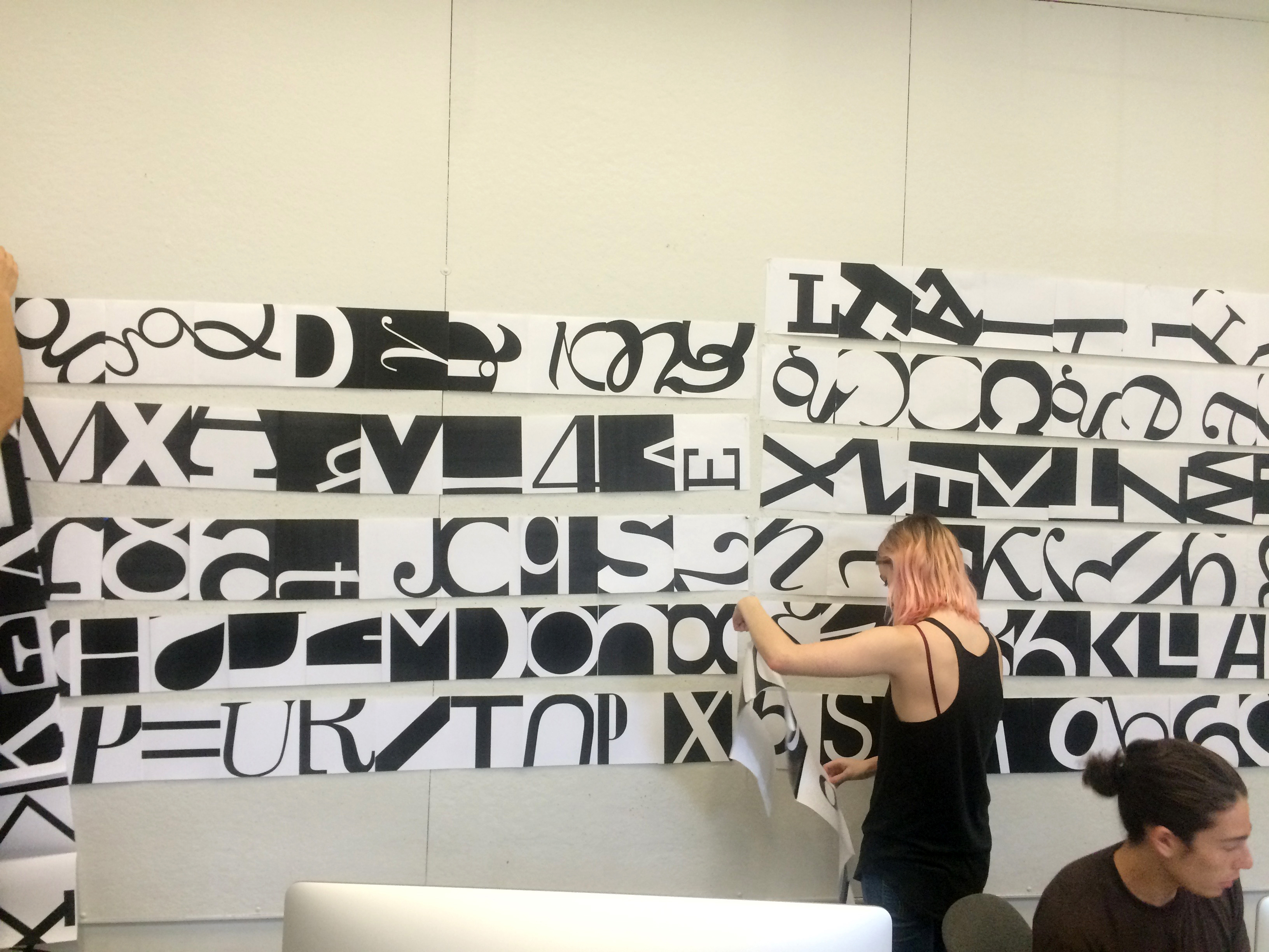
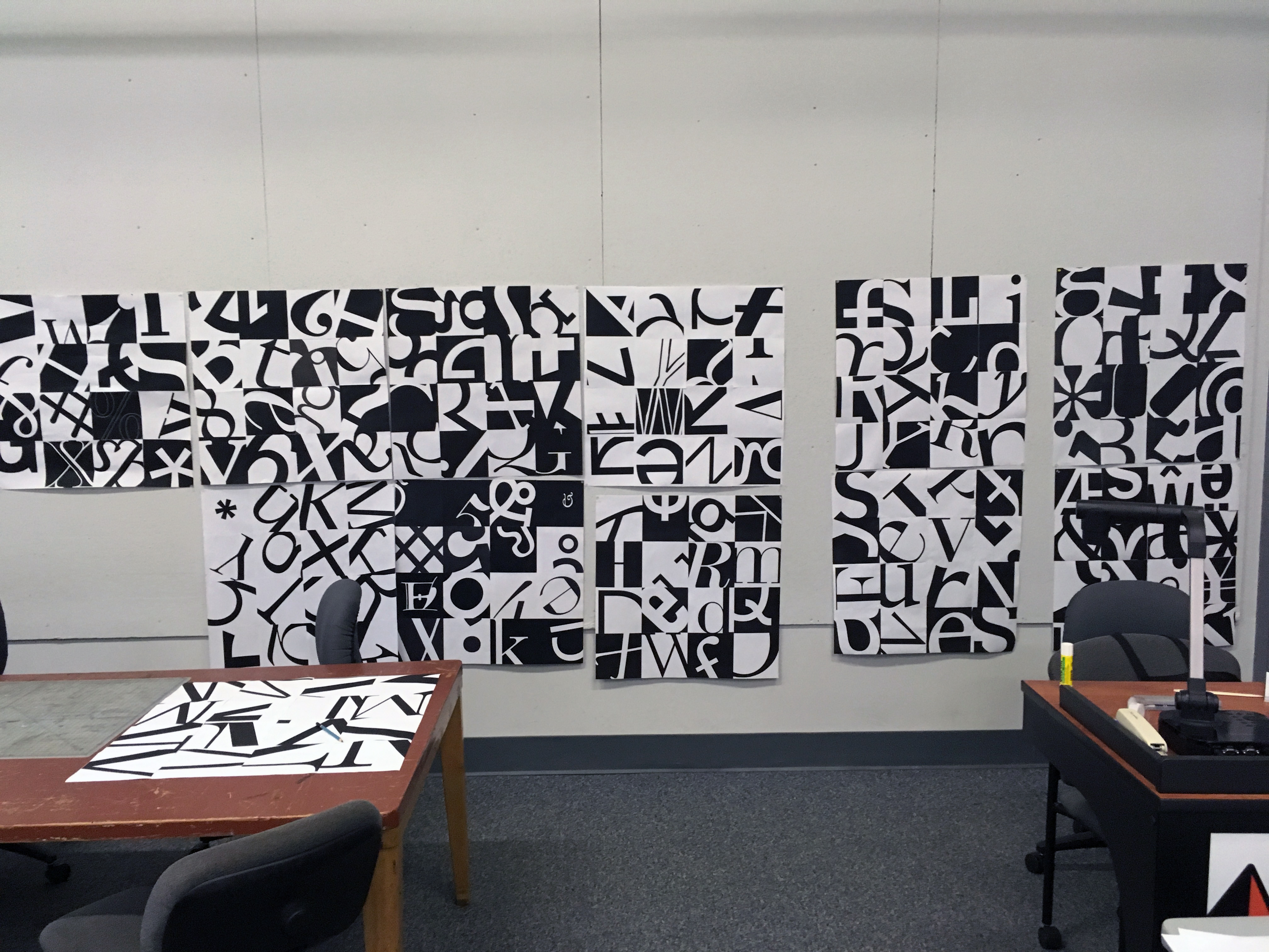
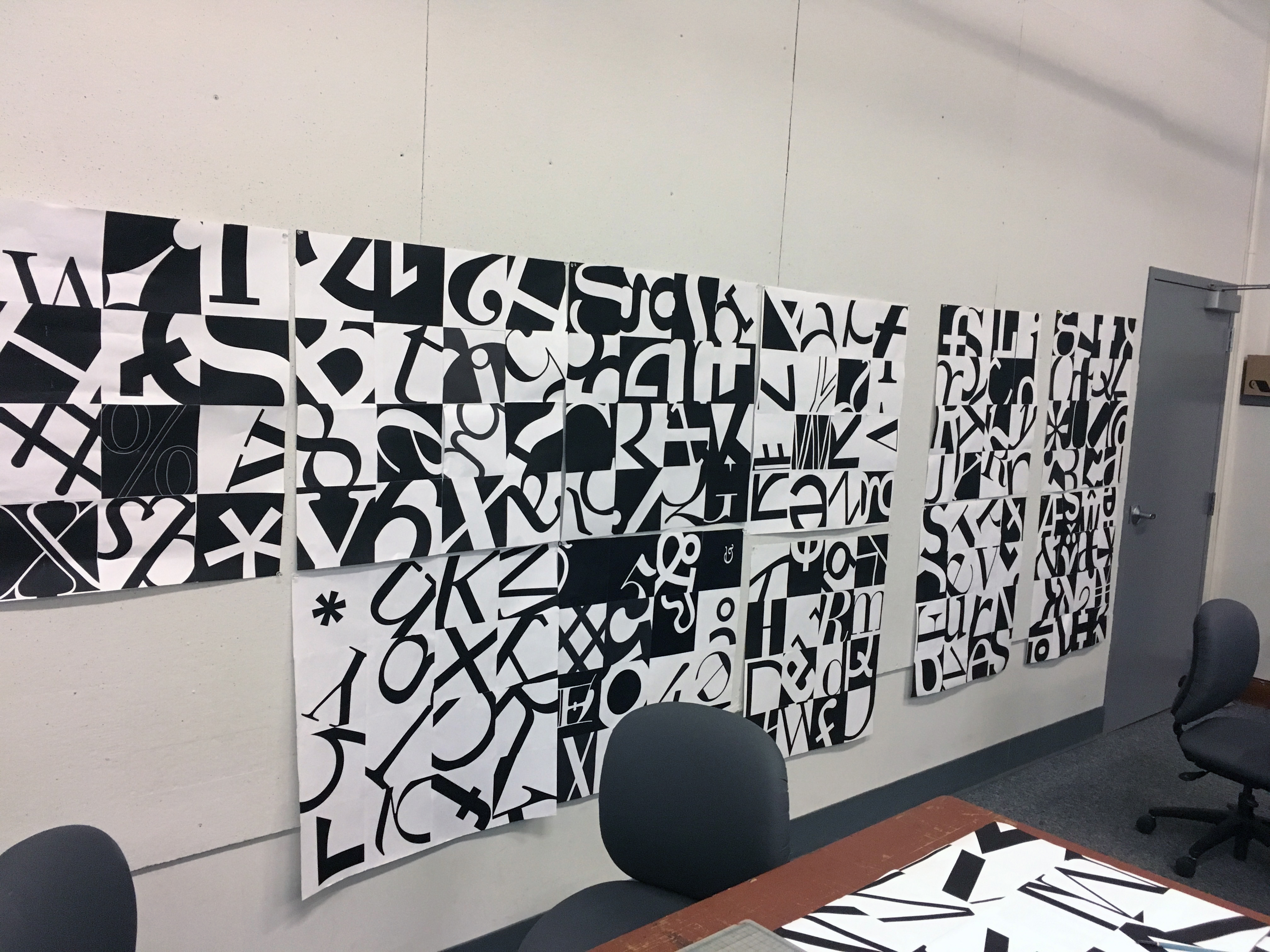
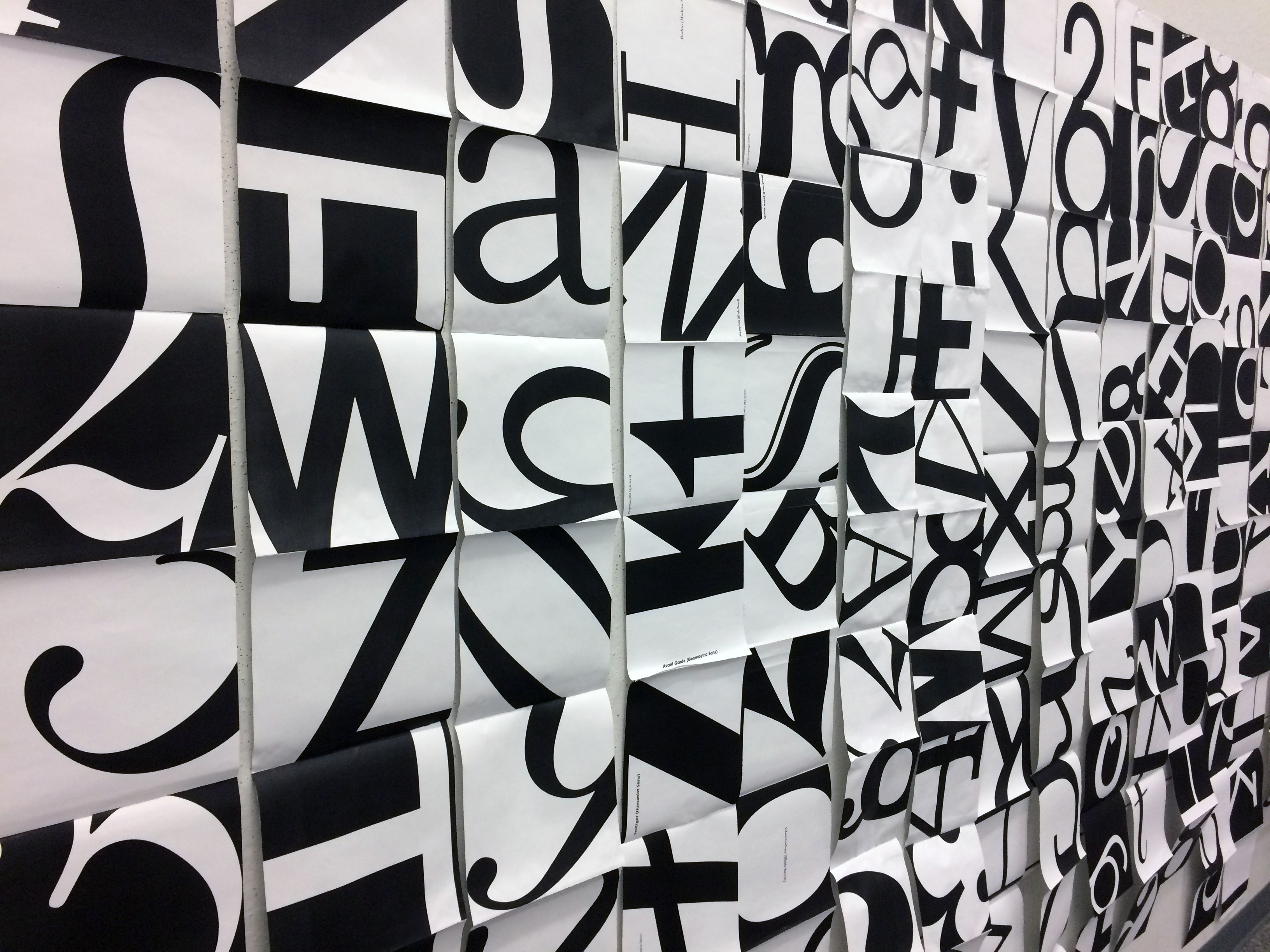
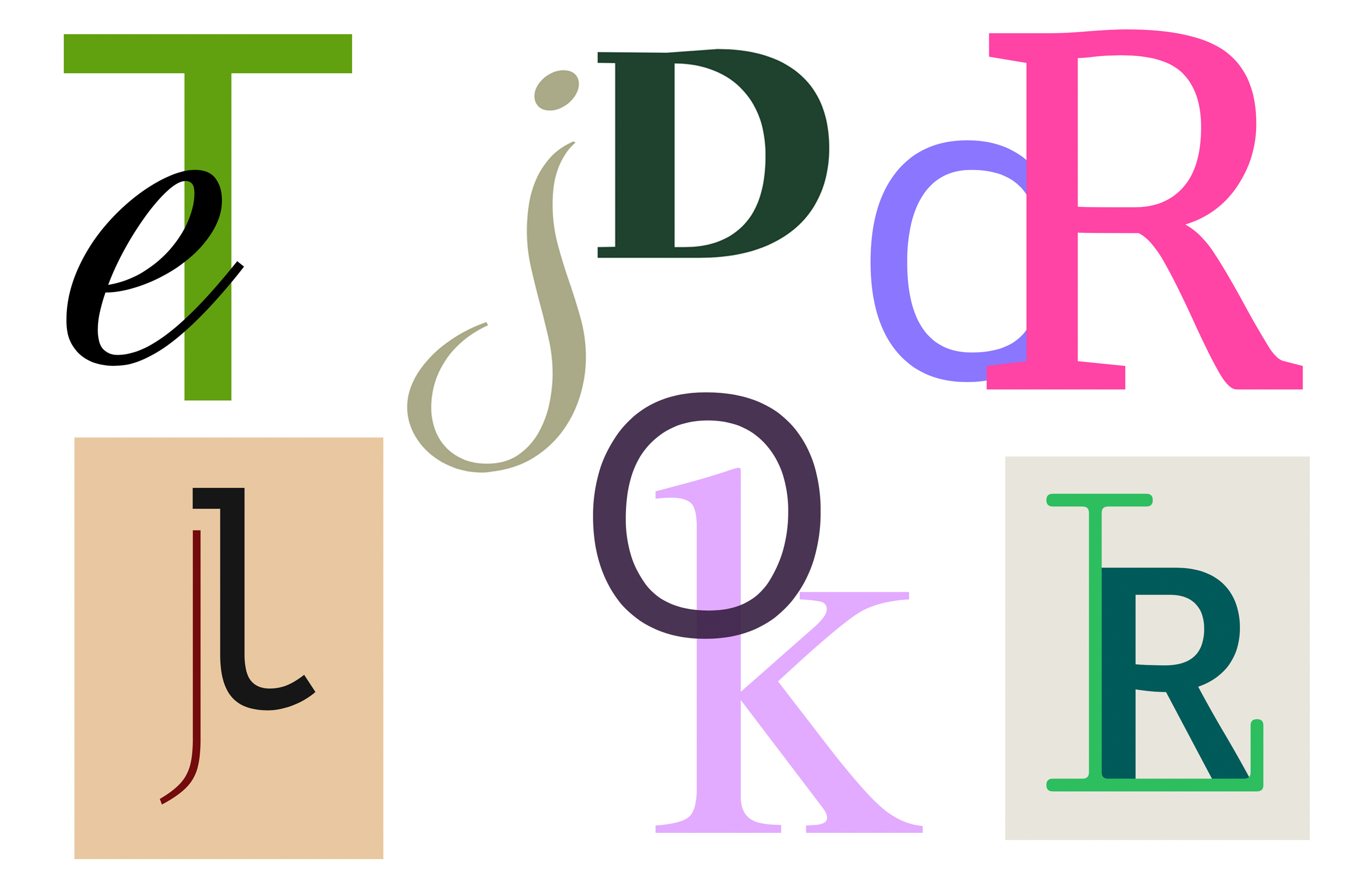
Project: Cropping the LetterformClass: Typography
Students explore the formal qualities of individual glyphs by cropping alphanumeric characters from a provided set of typefaces and arranging the crops into a grid.
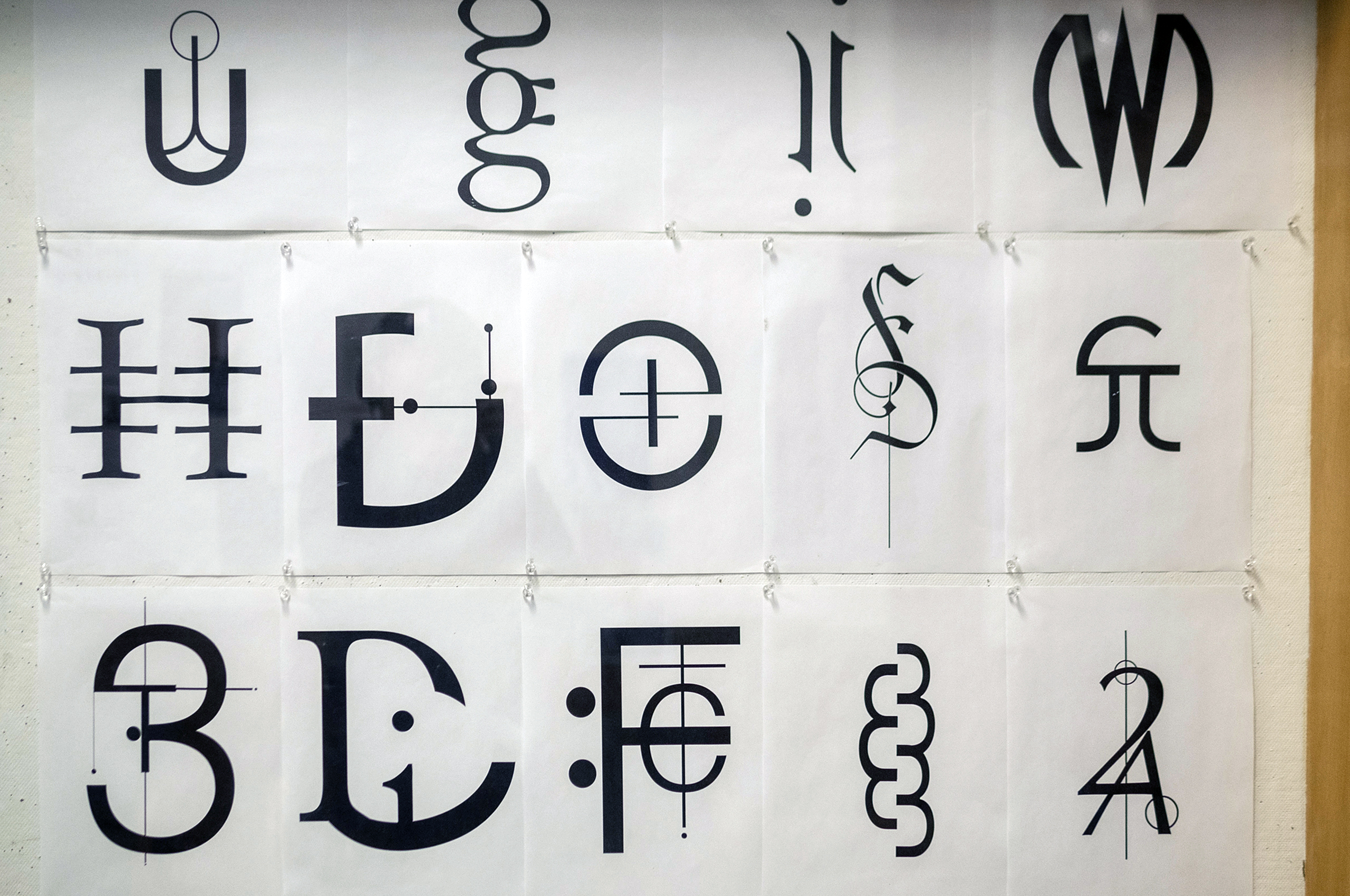
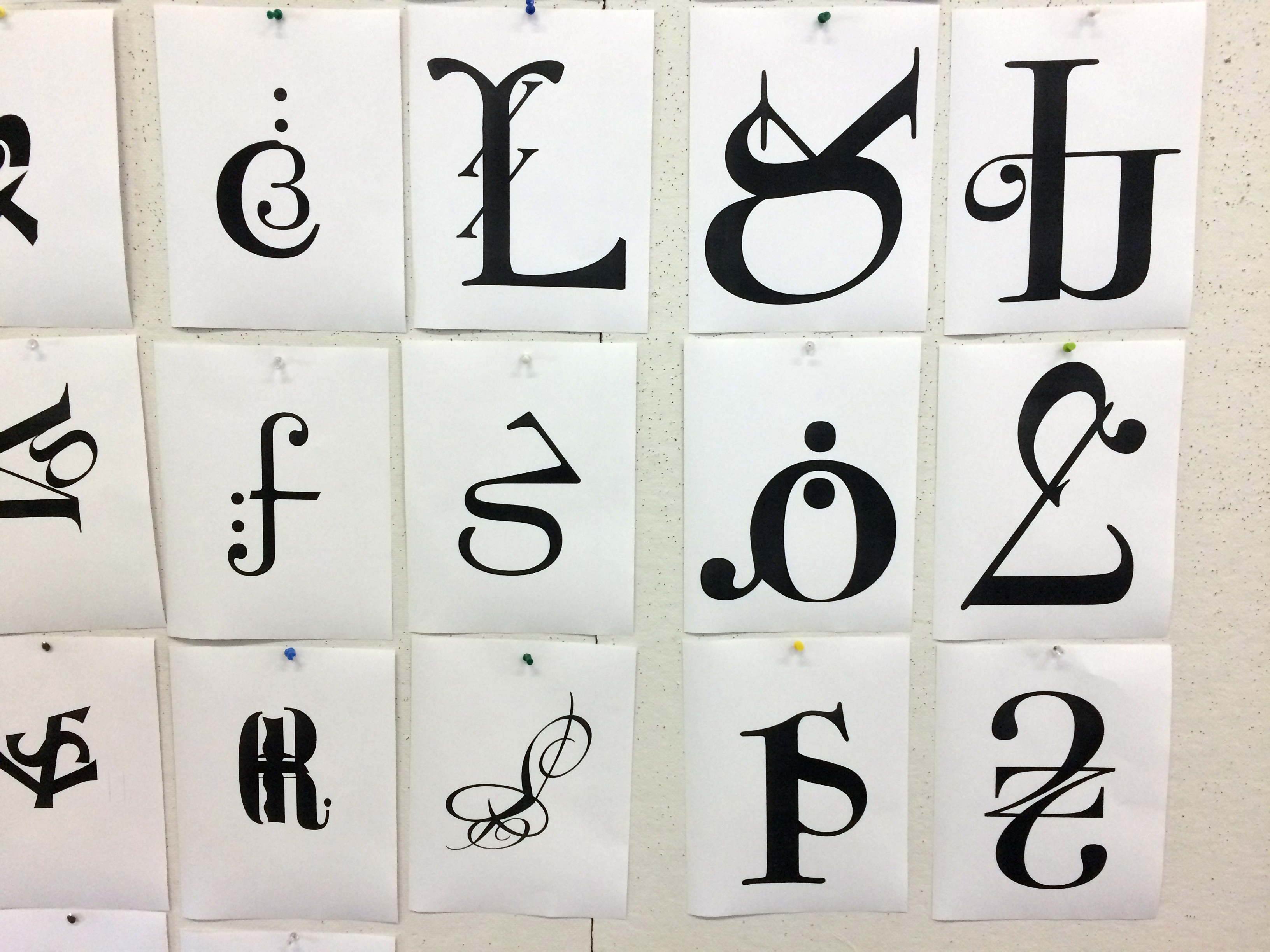


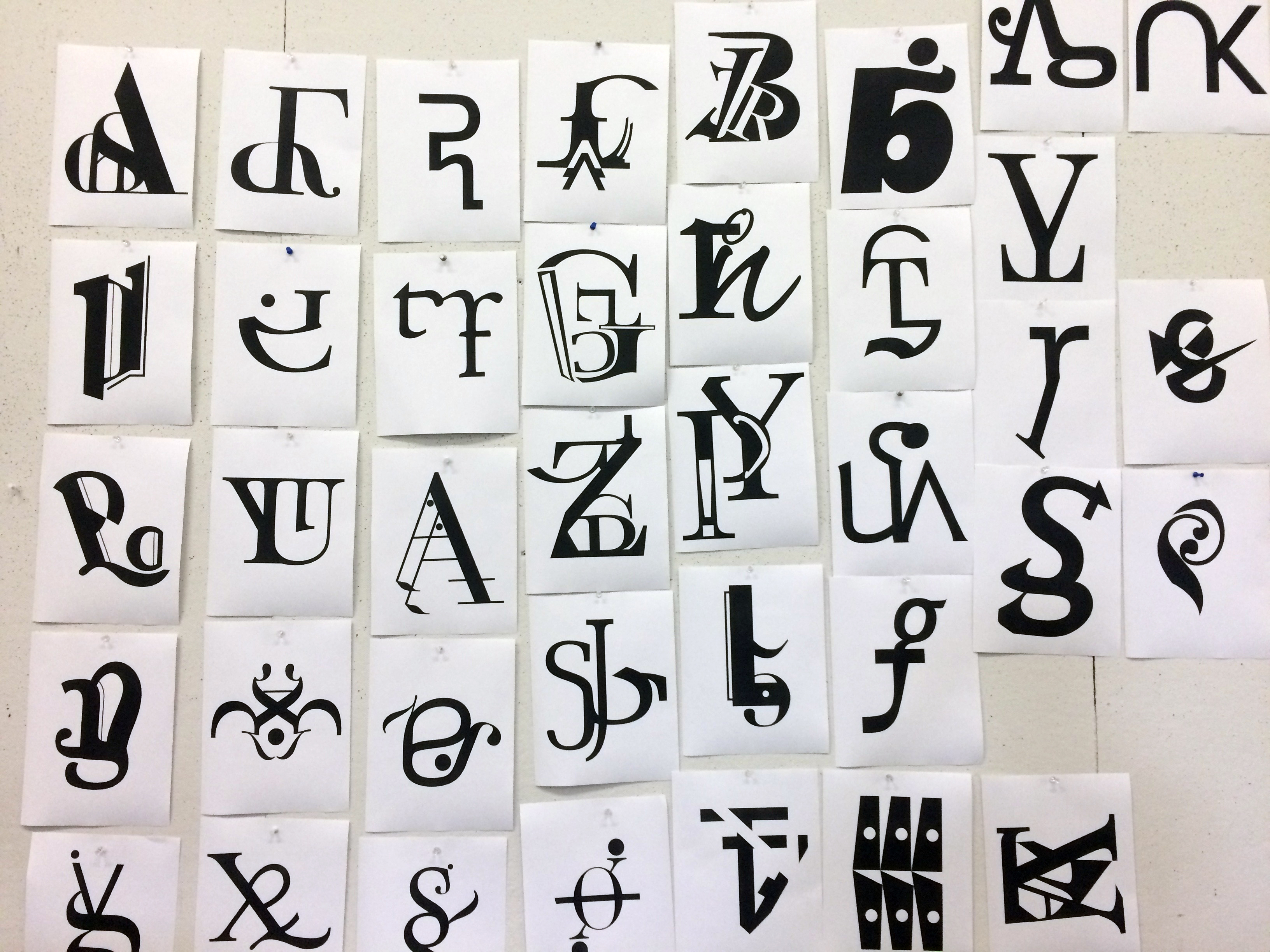
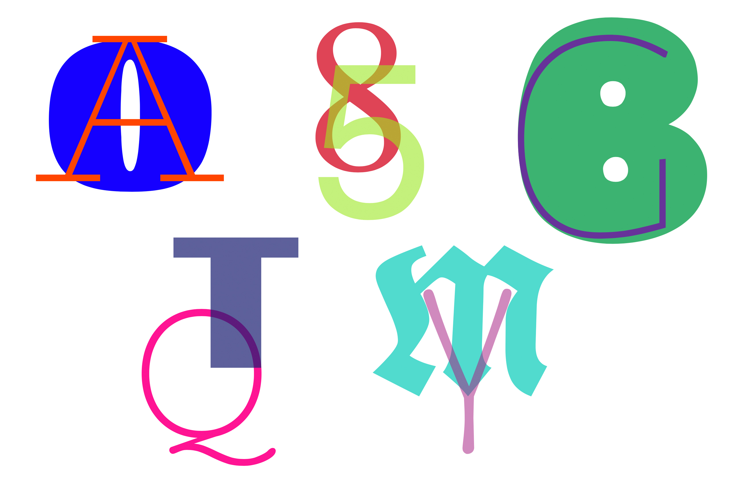
Project: Additive FormsClass: Typography
Students create hybrid letterforms using parts of existing typefaces.

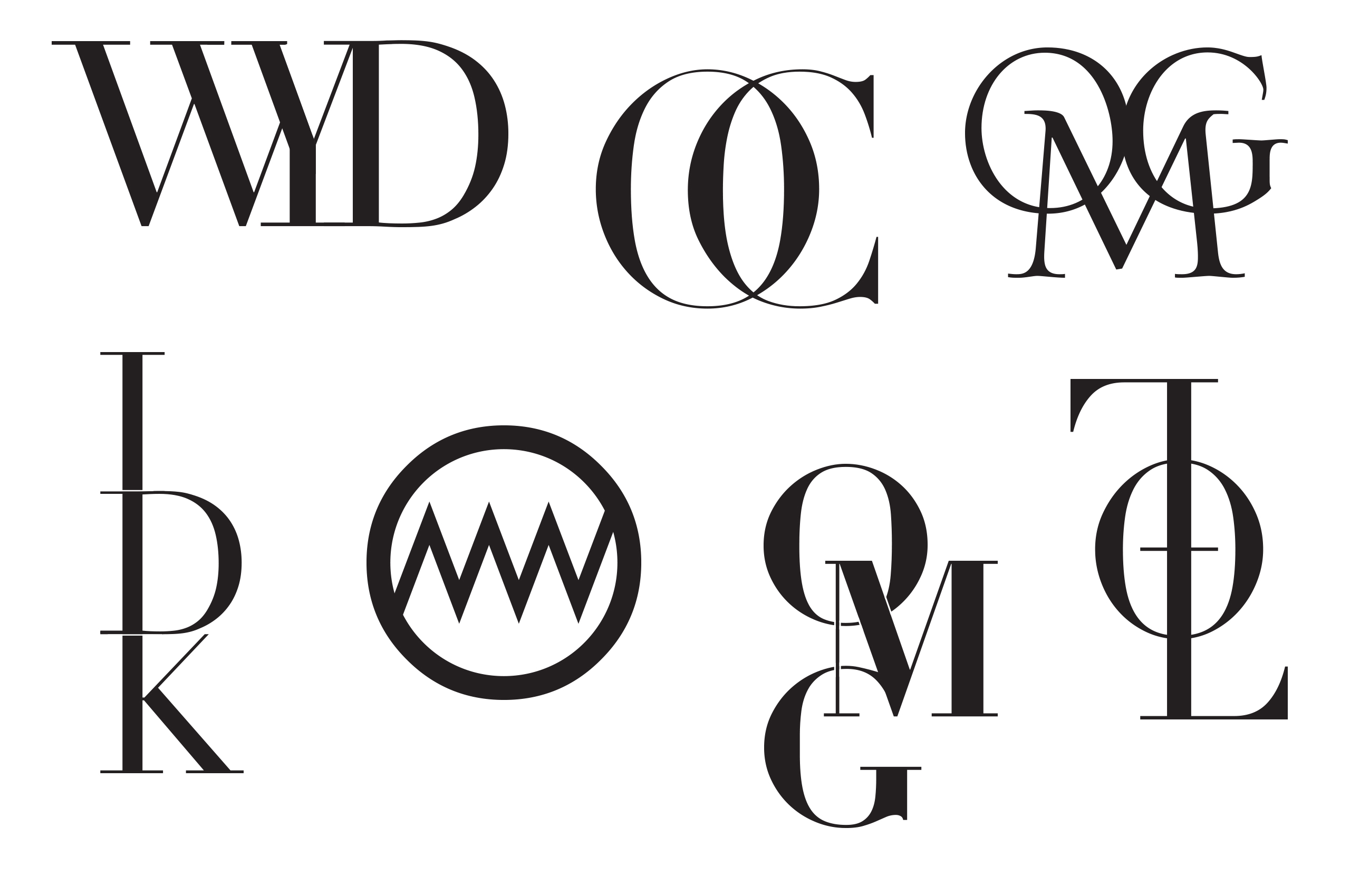
Project: MonogramsClass: Typography
Students create monograms using the letters in common acronyms.
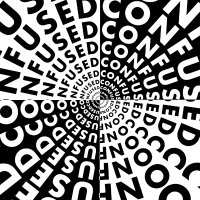

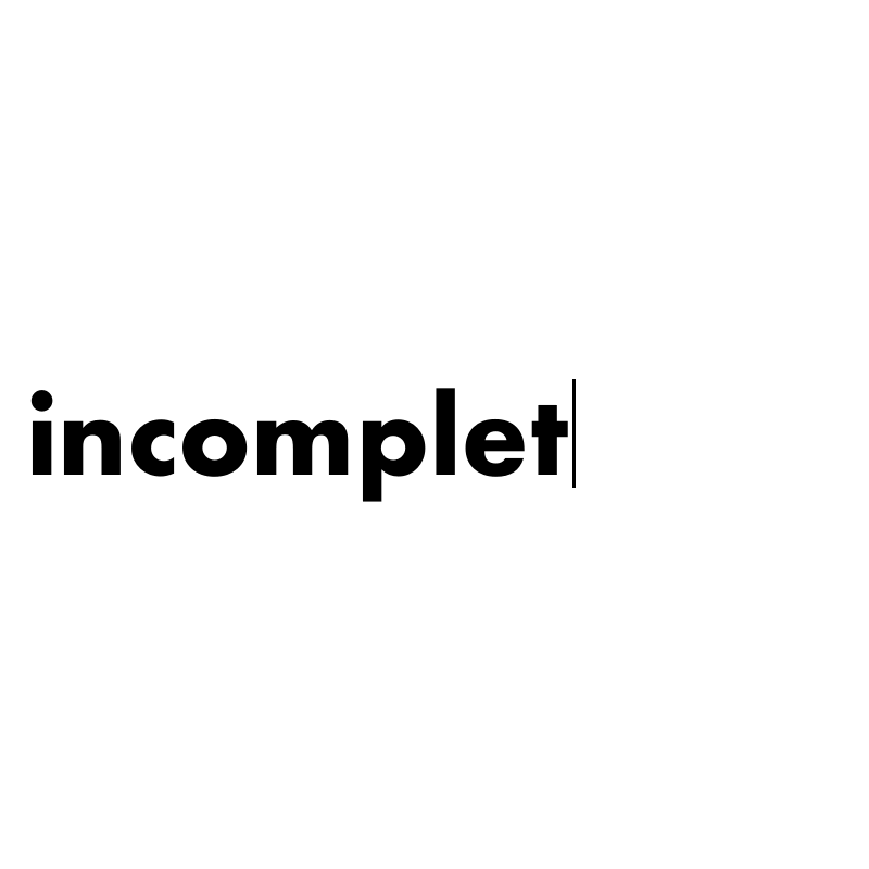
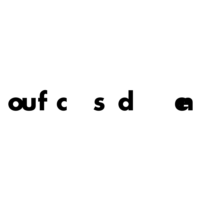

Project: Moving wordsClass: Typography
Students express the meaning of provided words by manipulating position, spacing or scale in print and subsequently motion.
Project: Type Contrast
Class: Typography
Students explore typographic contrast in the environment of the browser using only web fonts and absolute positioning properties.
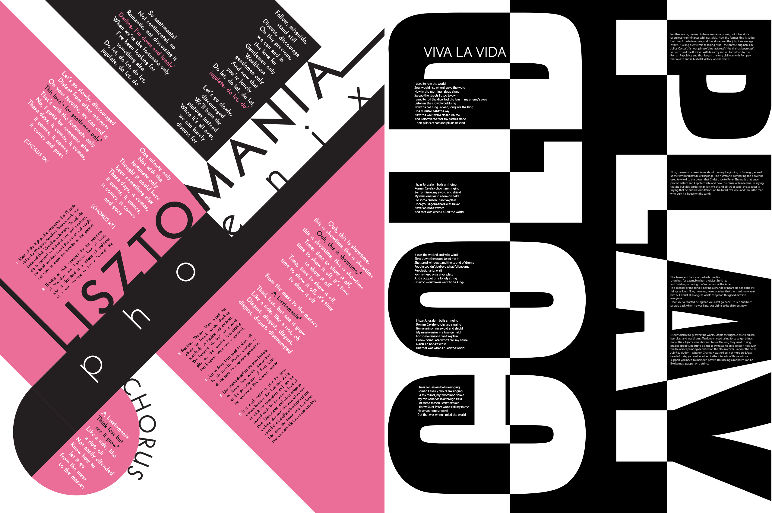
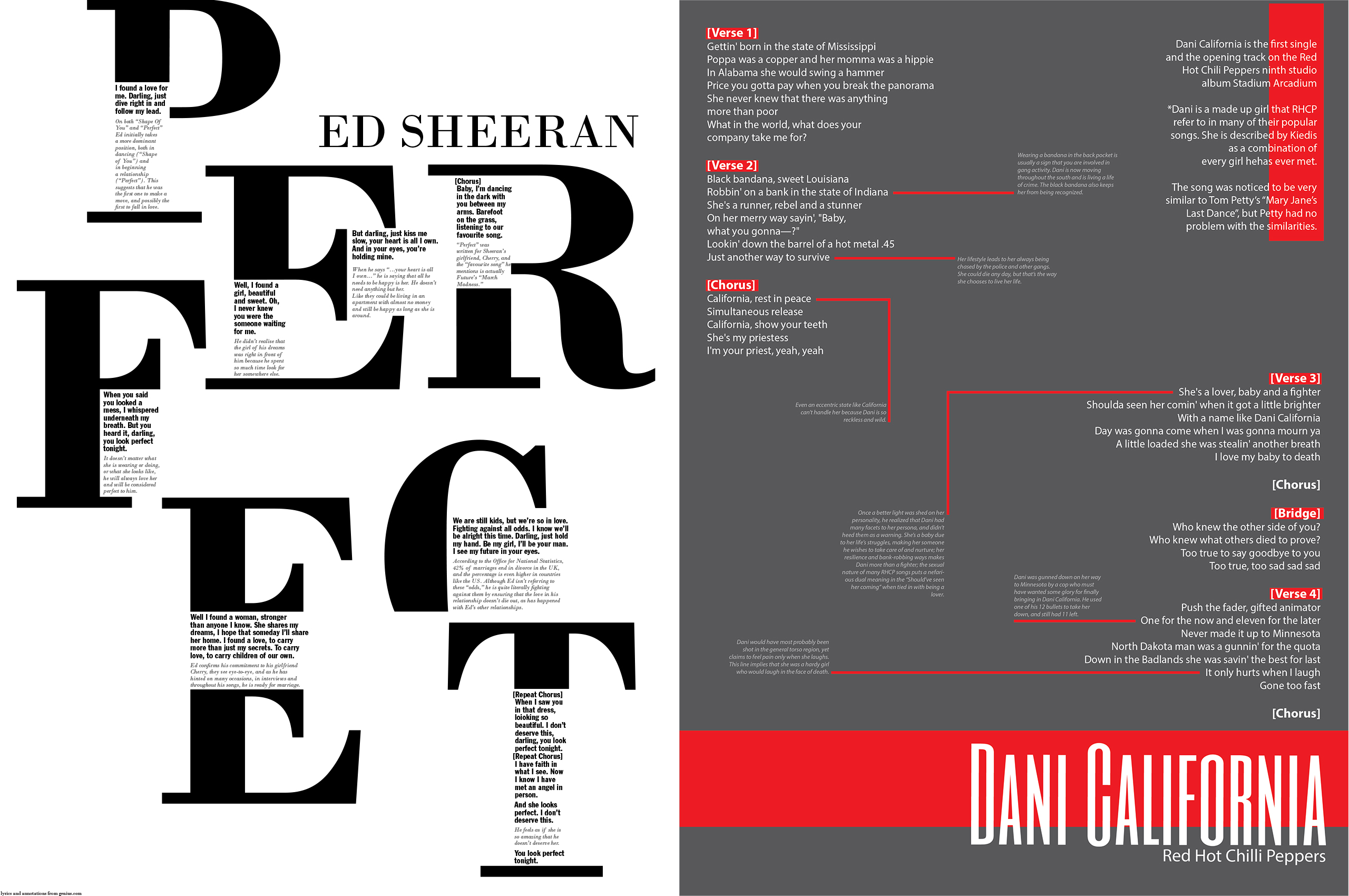
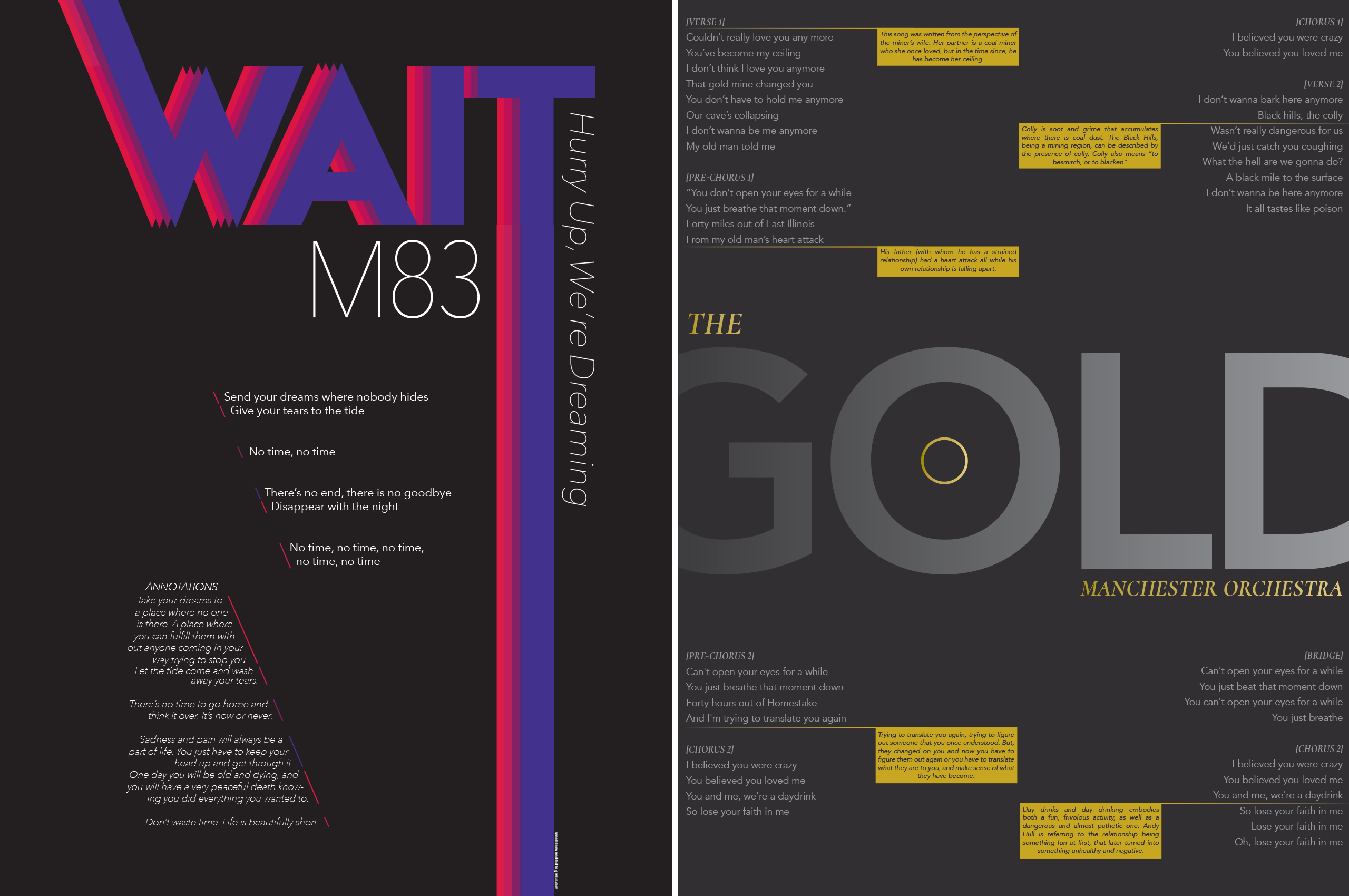

Project: Lyrics Poster
Class: Typography
To study typographic hierarchy students were asked to pick a popular song and design an 18X24” poster that combined the lyrics with text explaining the meaning behind them sourced from the website genius.com.
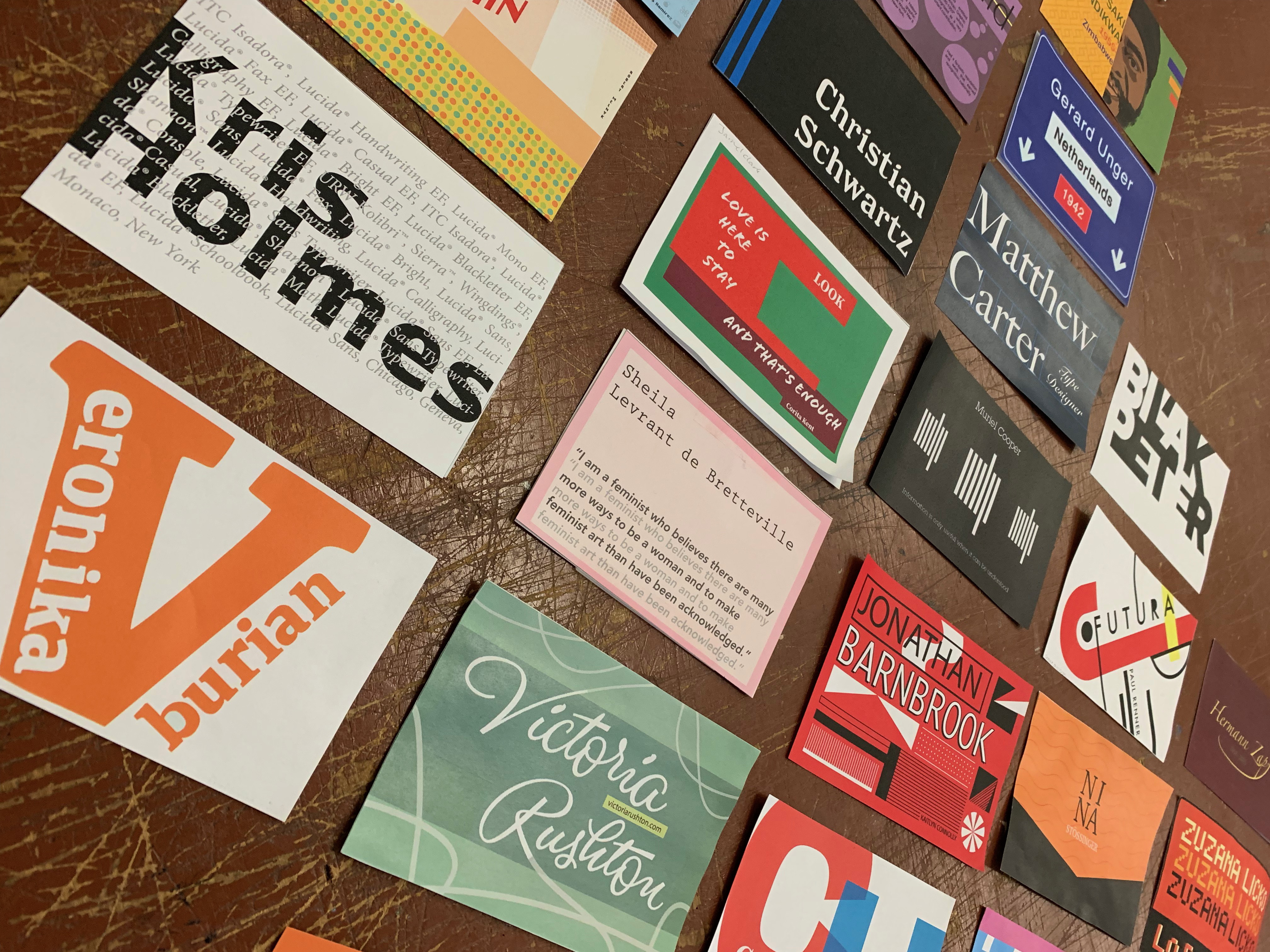
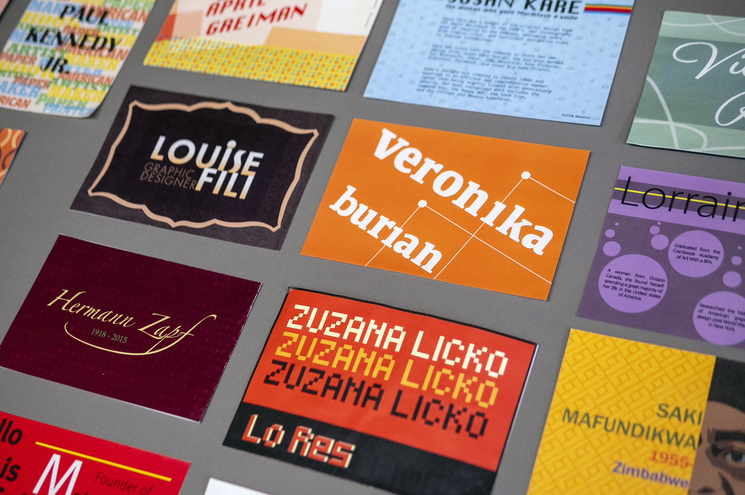
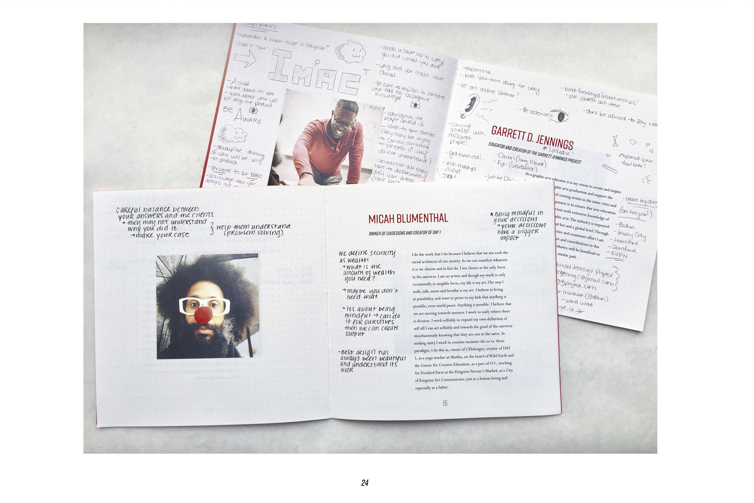
Project: PractitionersClass: Typography
Students were asked to design a 6×4 in card (front and back) and present about the work of an assiged type designer/typographer.
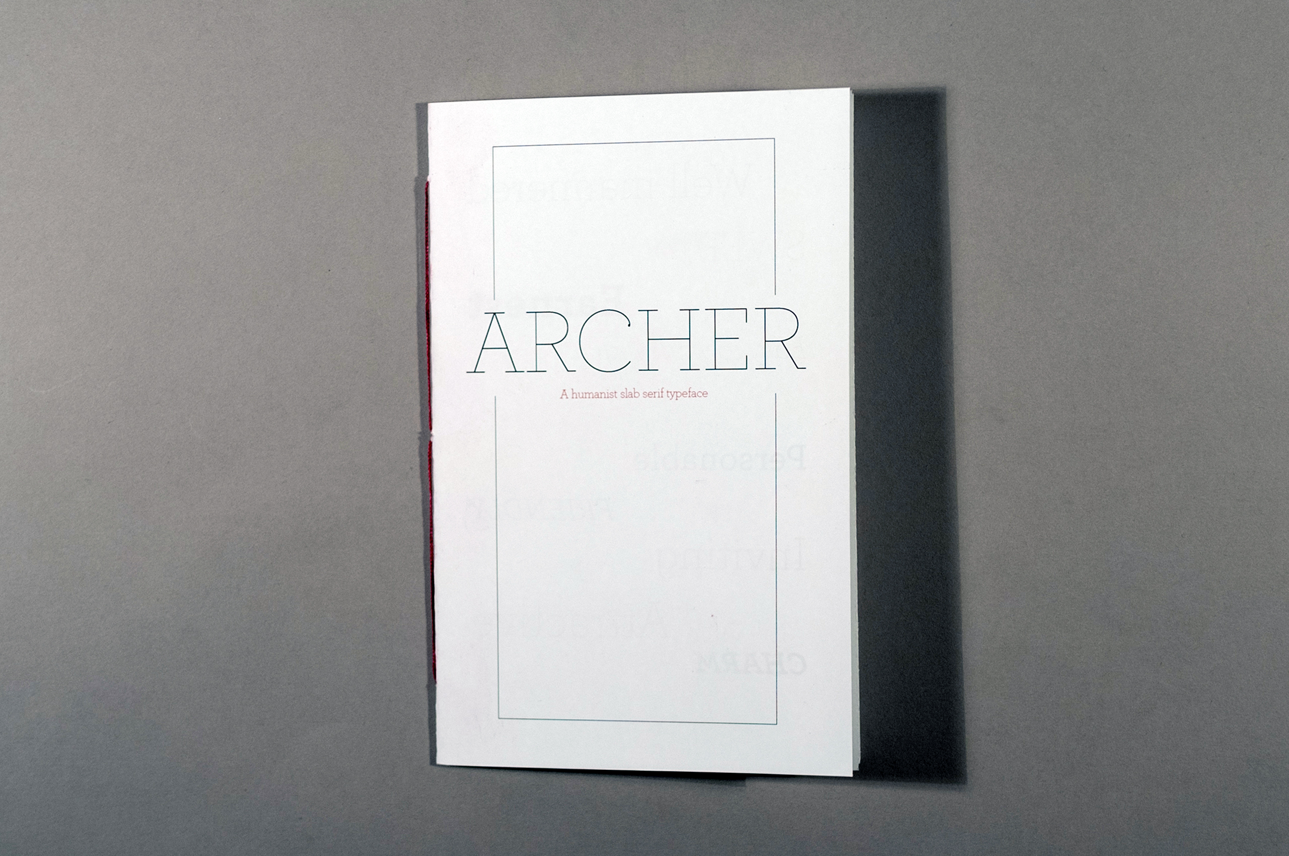
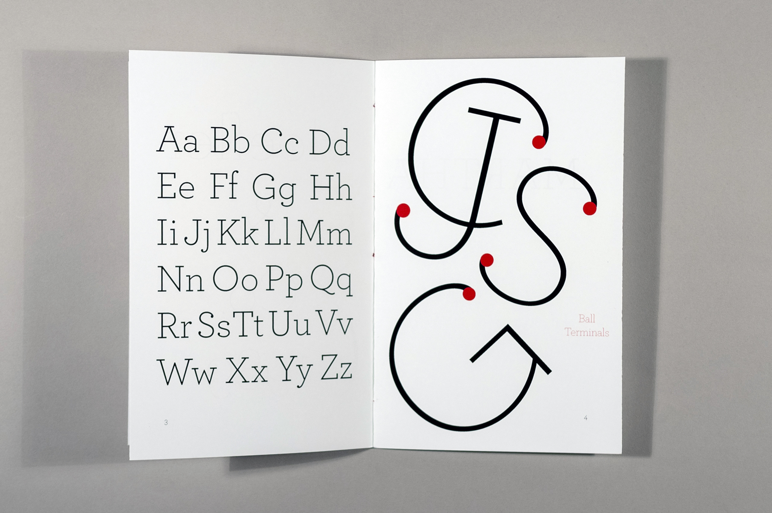
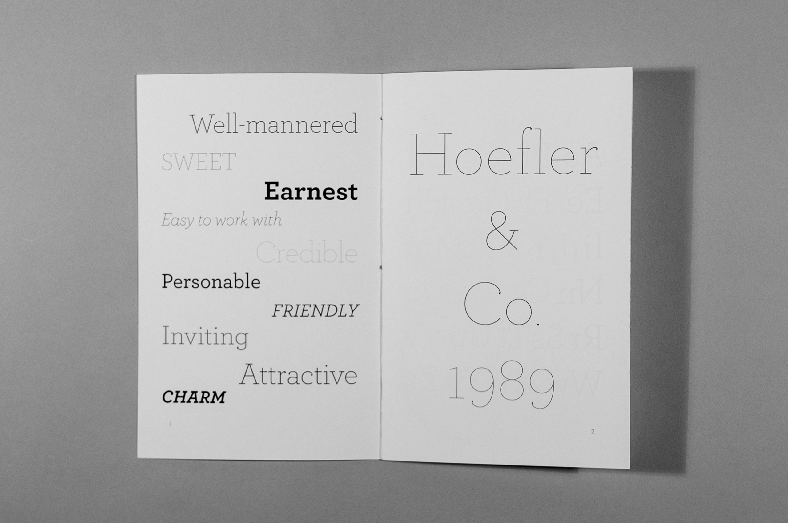
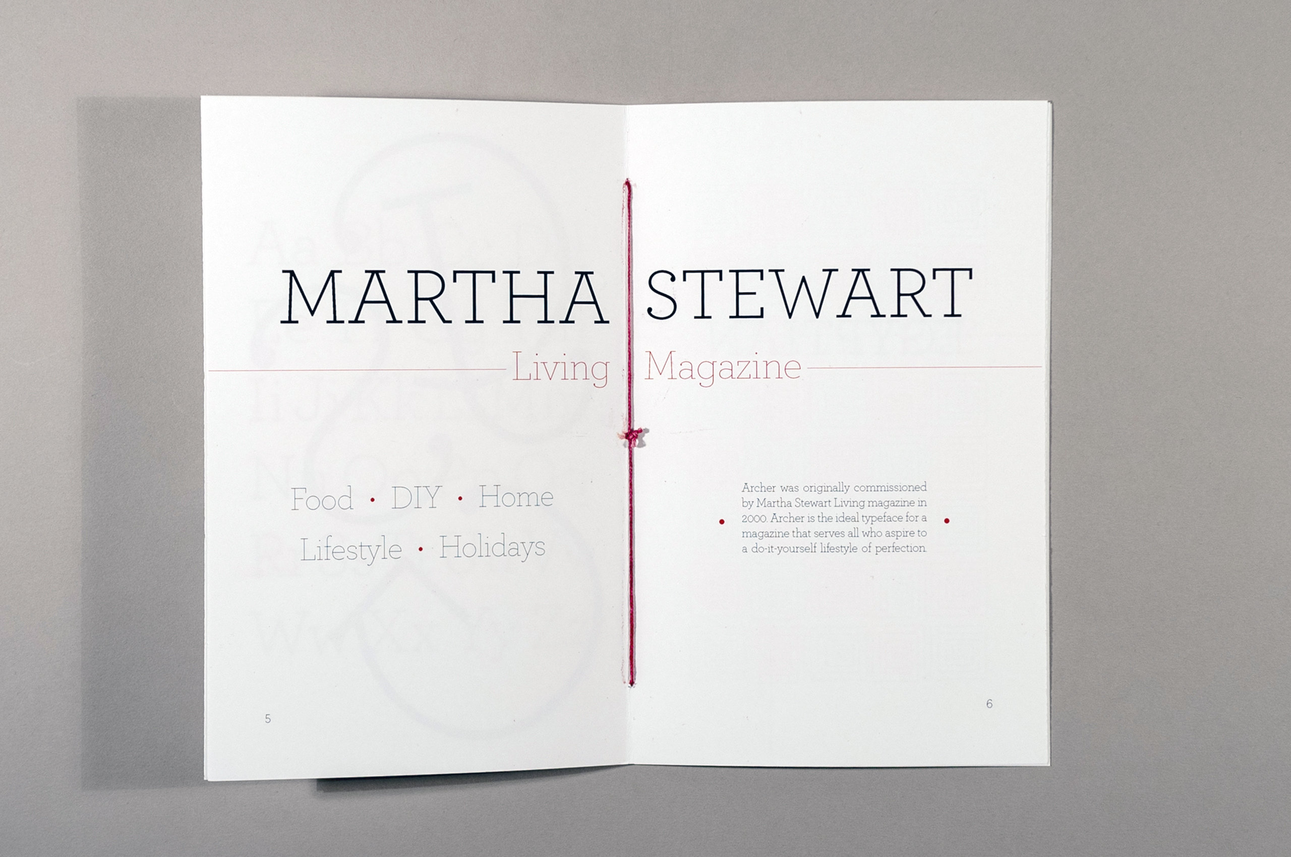

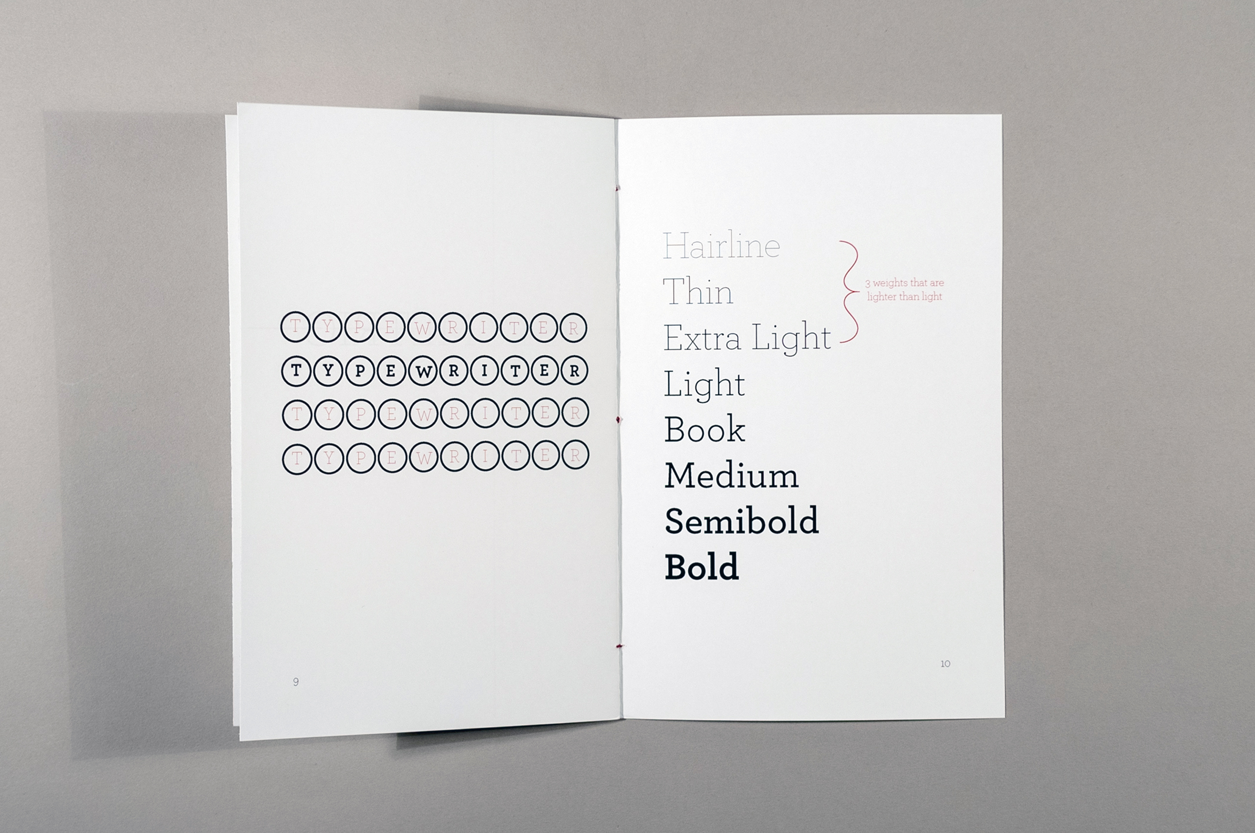
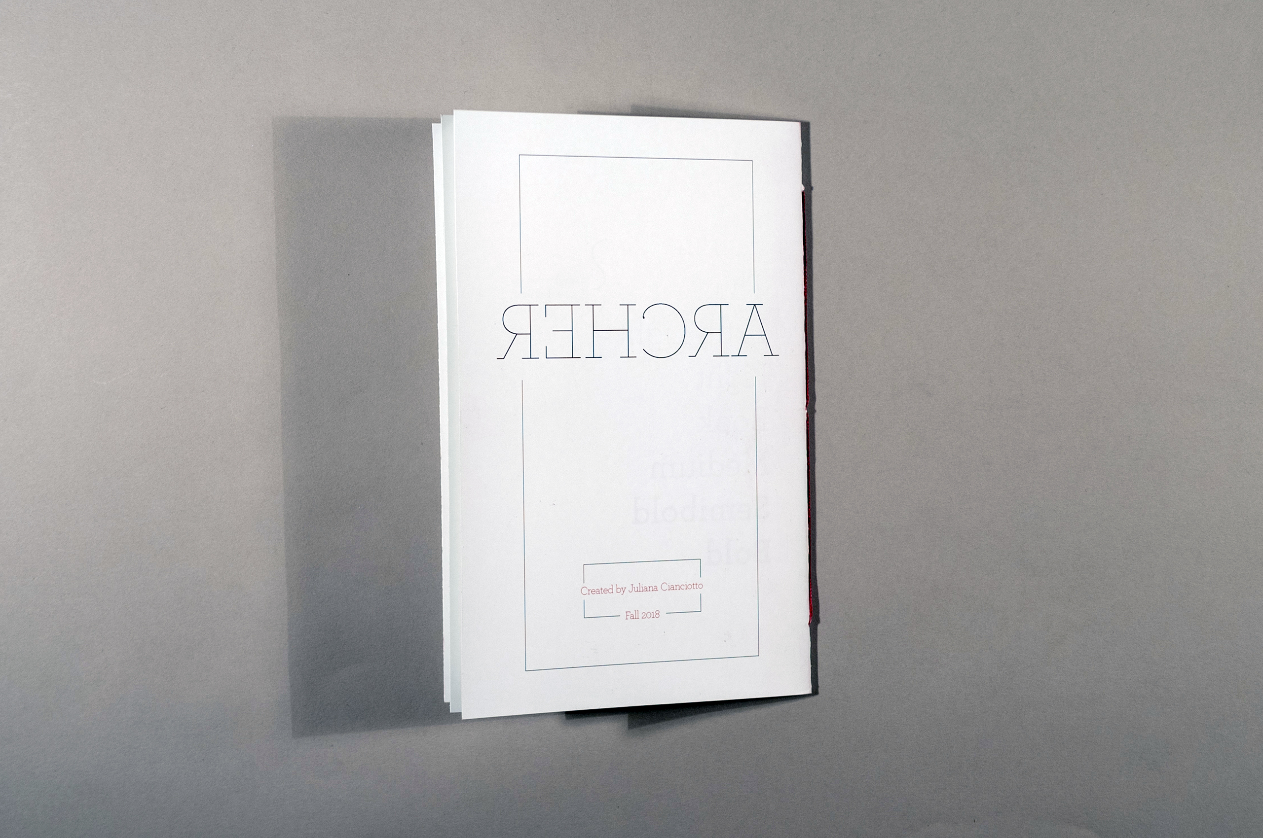
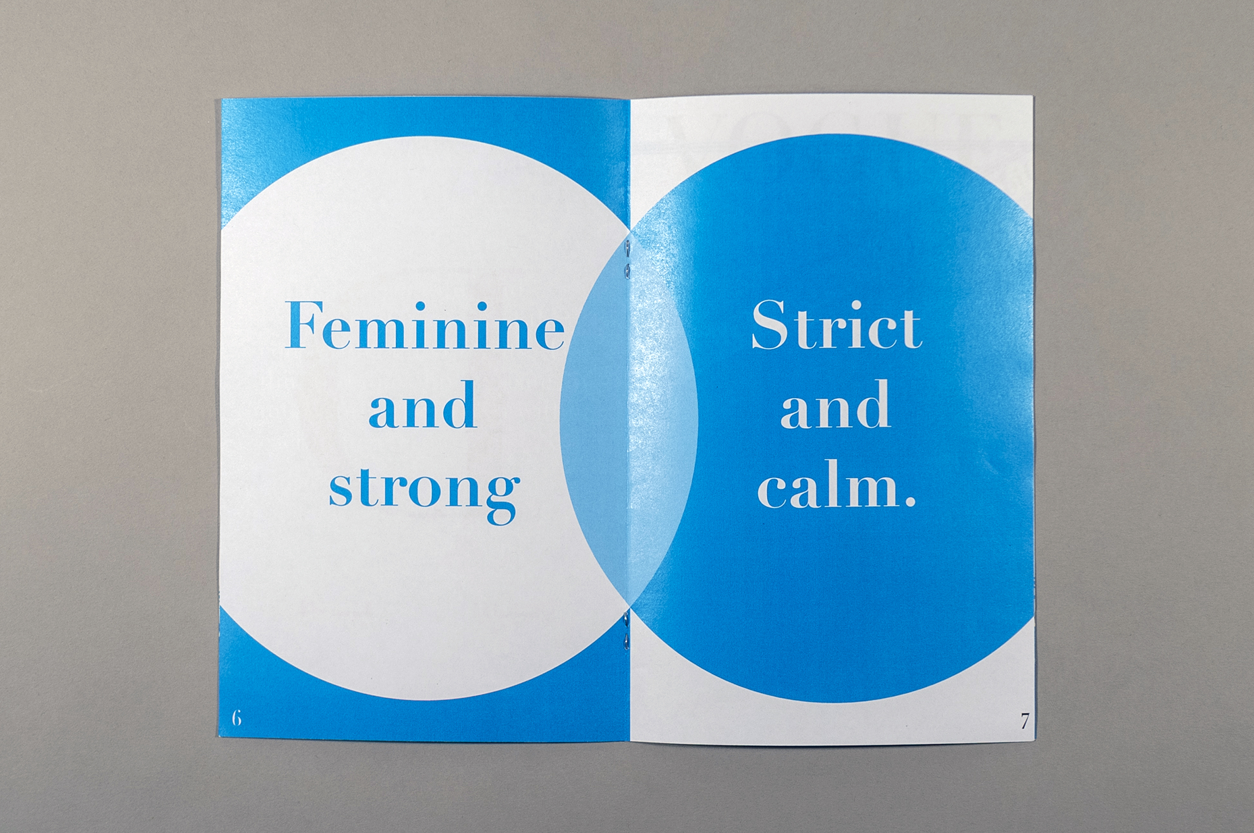
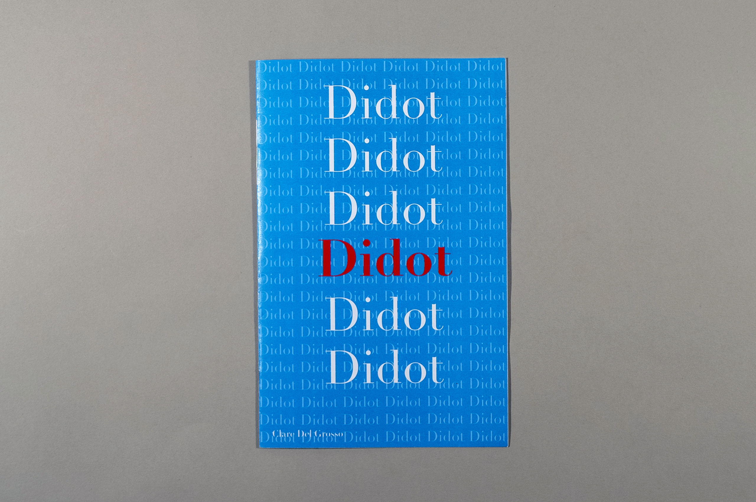
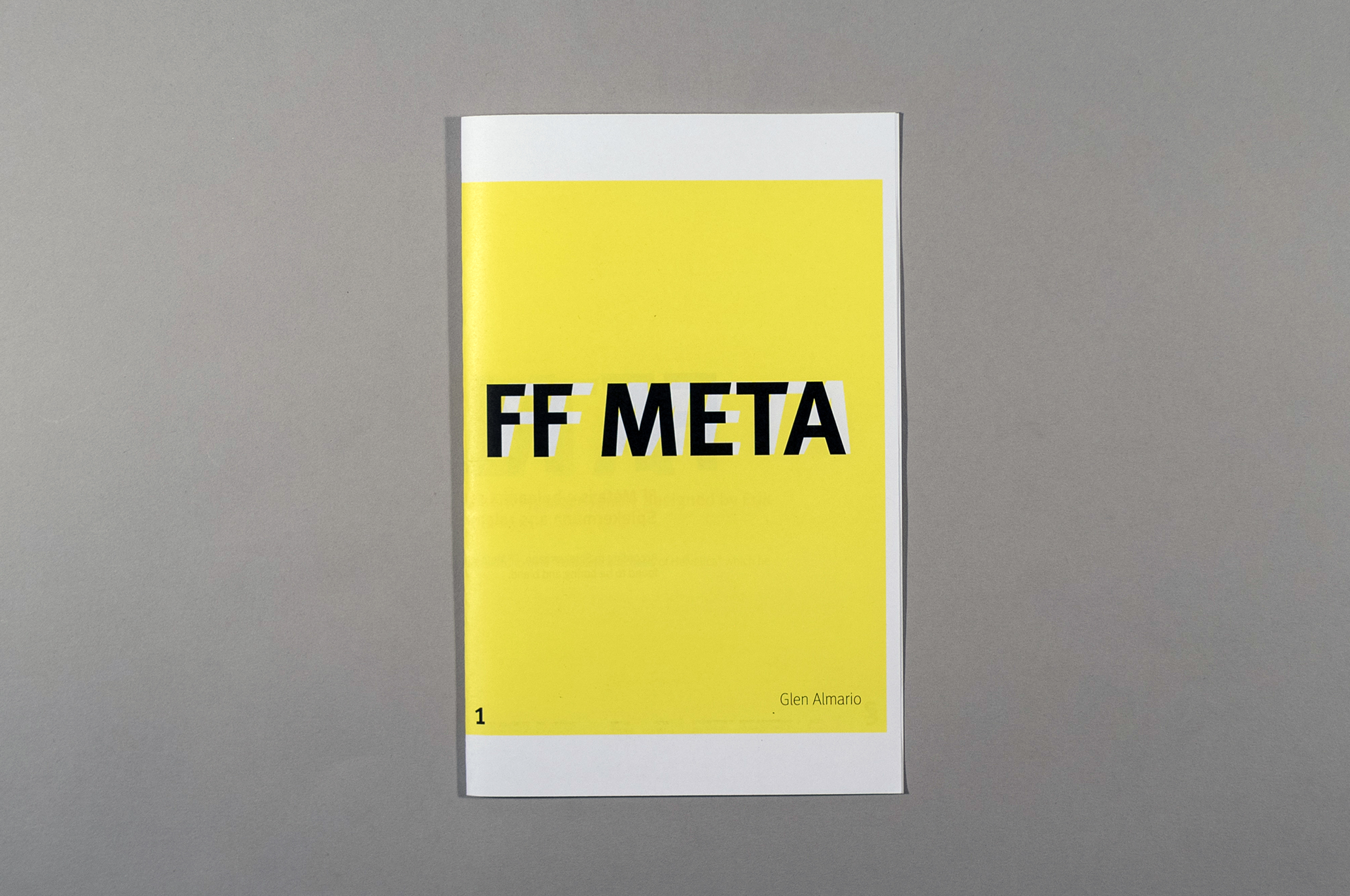

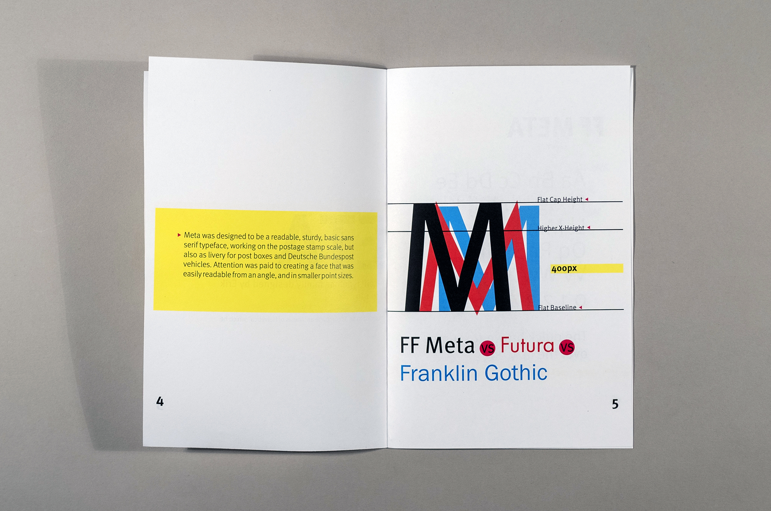
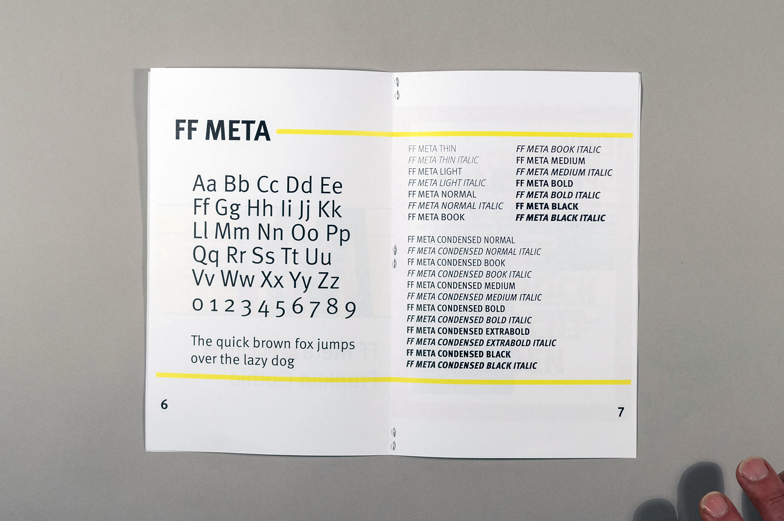


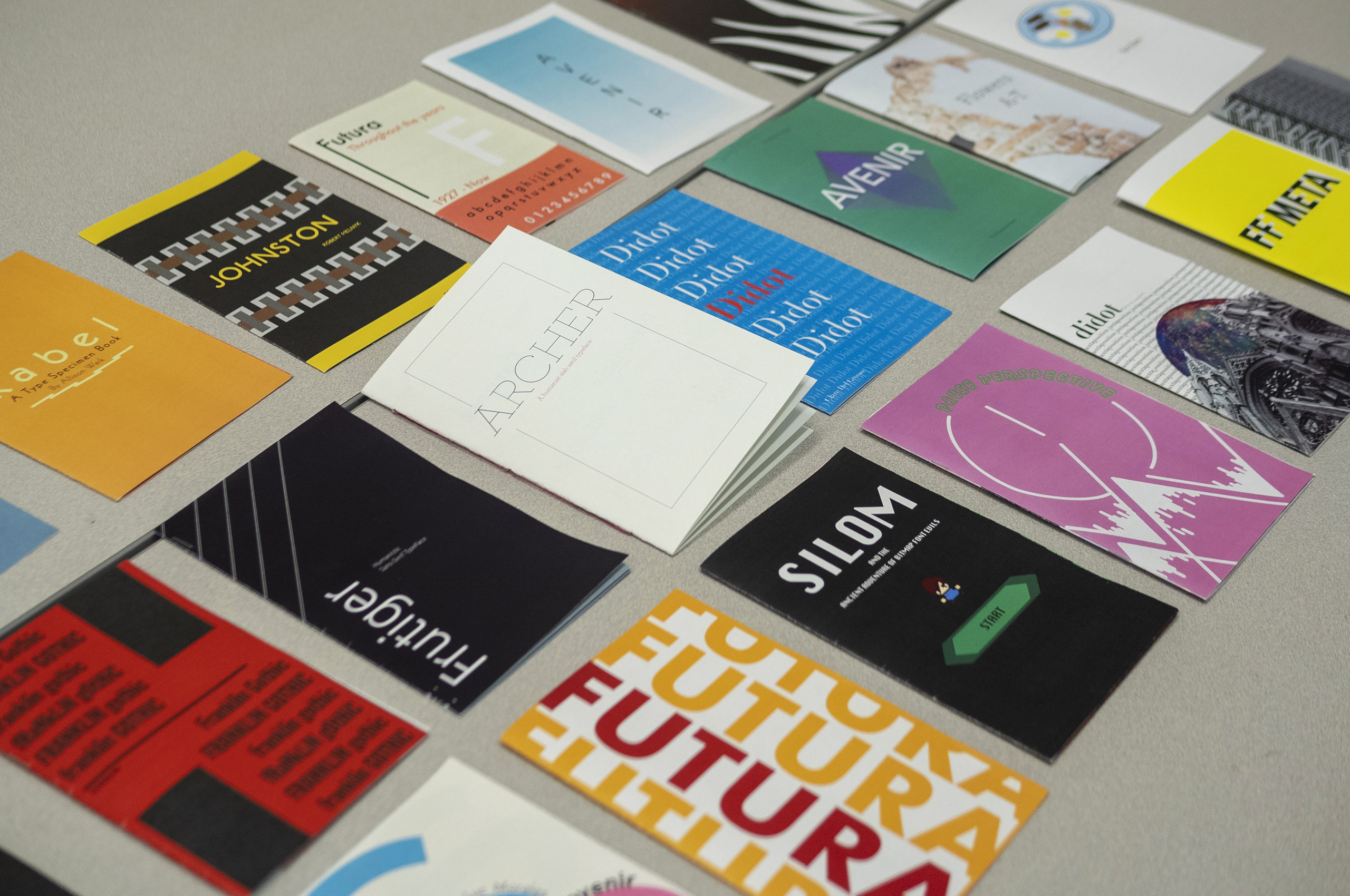
Project: Type Specimen ZinesClass: Typography
Toward the end of the semester students were asked to design a zine that showcases a typeface of their choice.
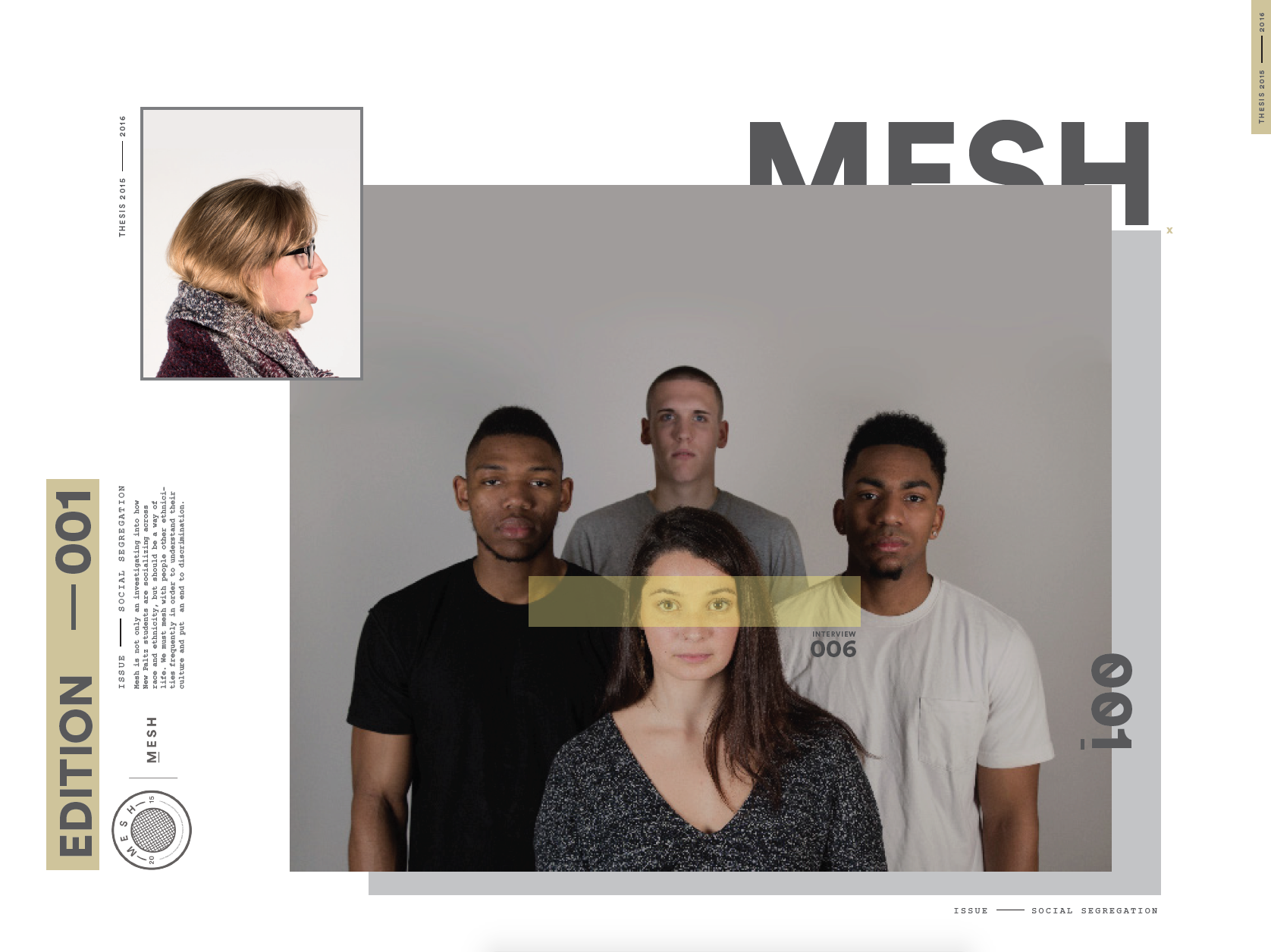
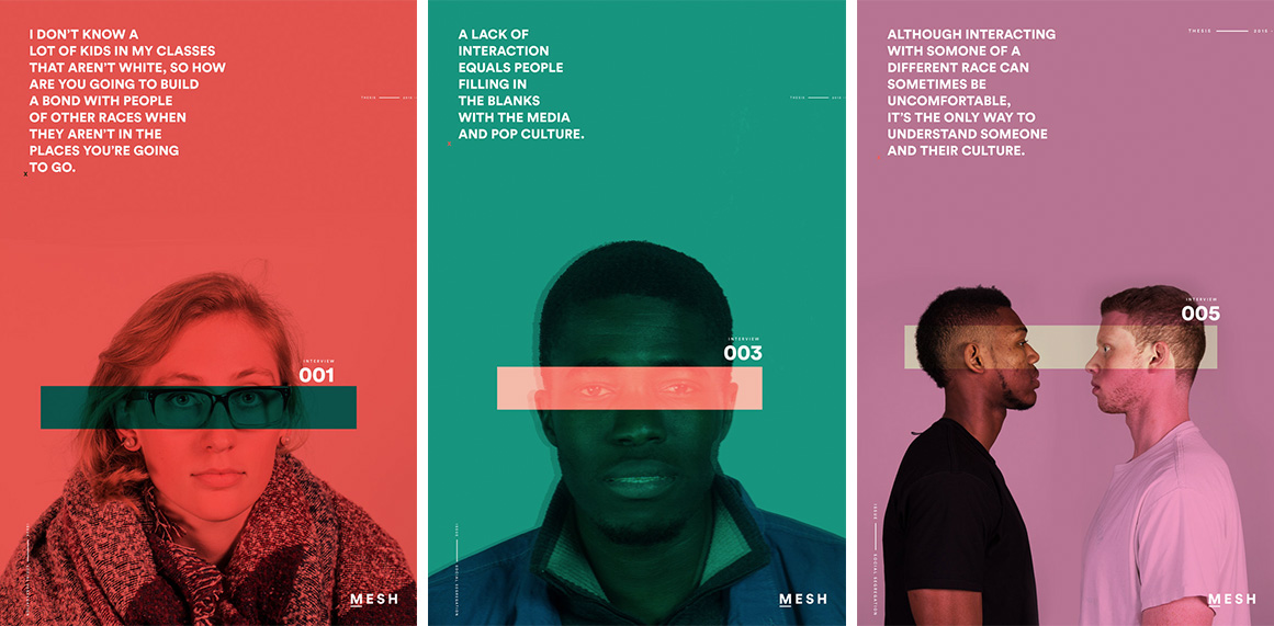
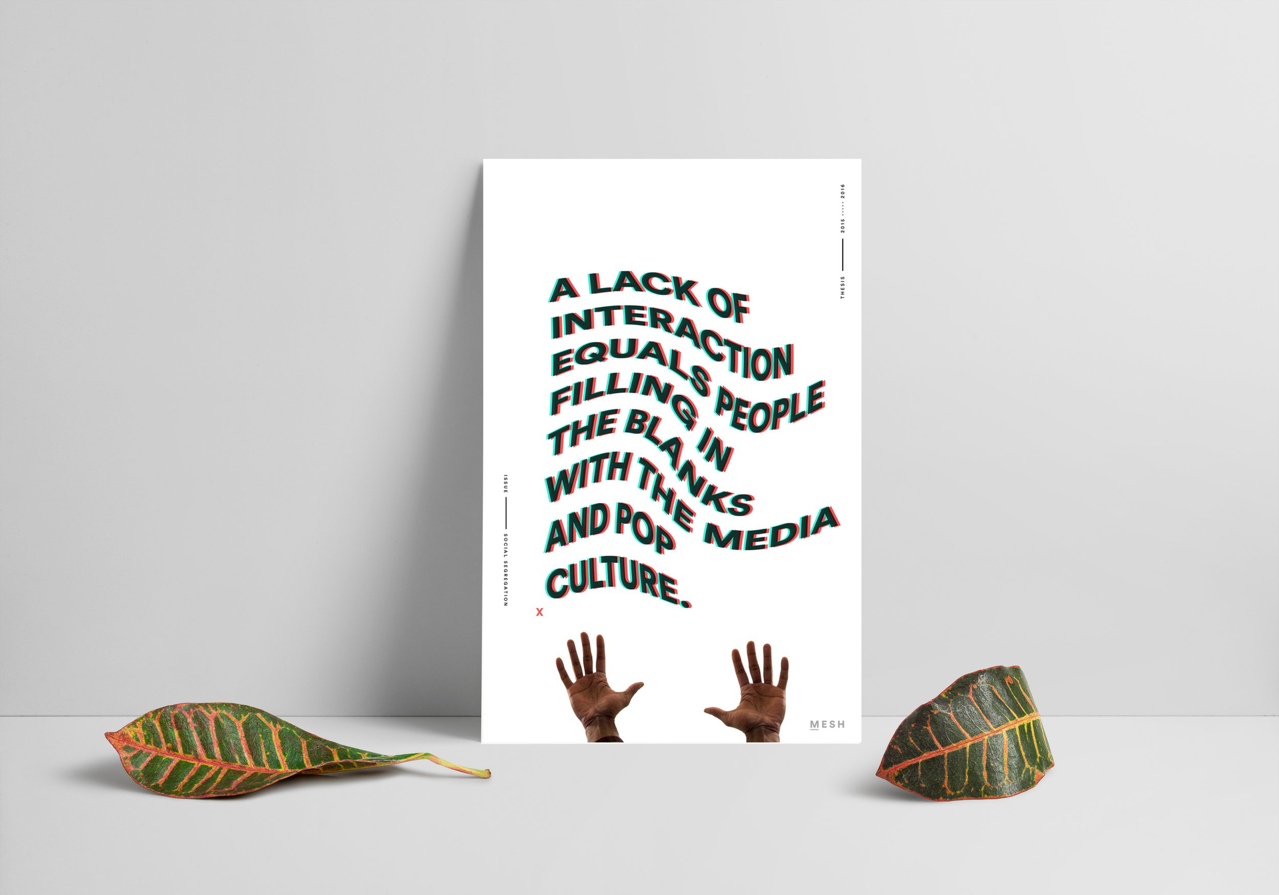
Project: MeshStudent: Andrew Joseph
Class: Thesis II
Drew writes: “The Mesh project sought to investigate how SUNY New Paltz students socialize across racial lines and ethnic barriers. It also explored the many emotions surrounding these interactions. The purpose of this thesis project was to attempt to understand why social life between majorities and minorities is so segregated on the New Paltz campus. This problem is significant because the only way to understand and accept someone is through interaction and conversation.”
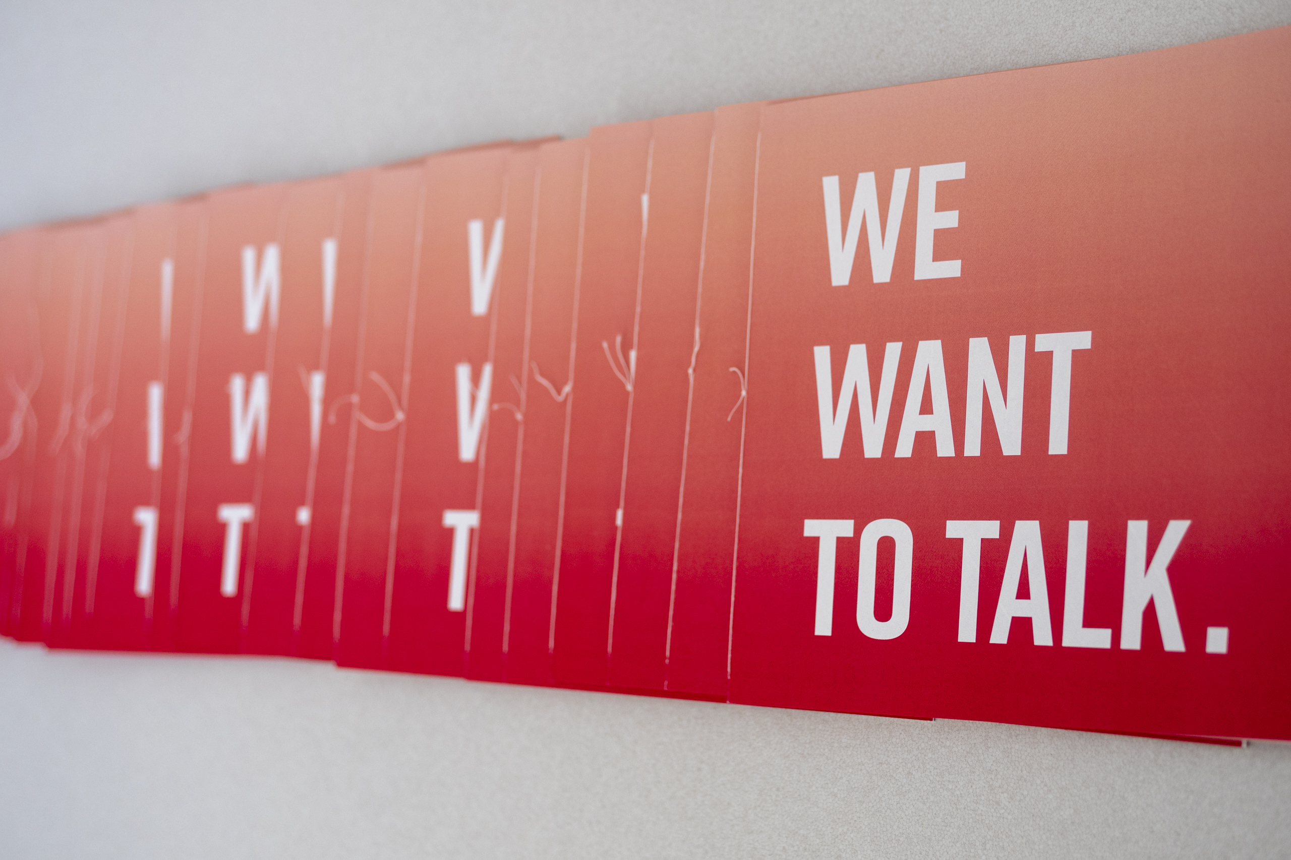
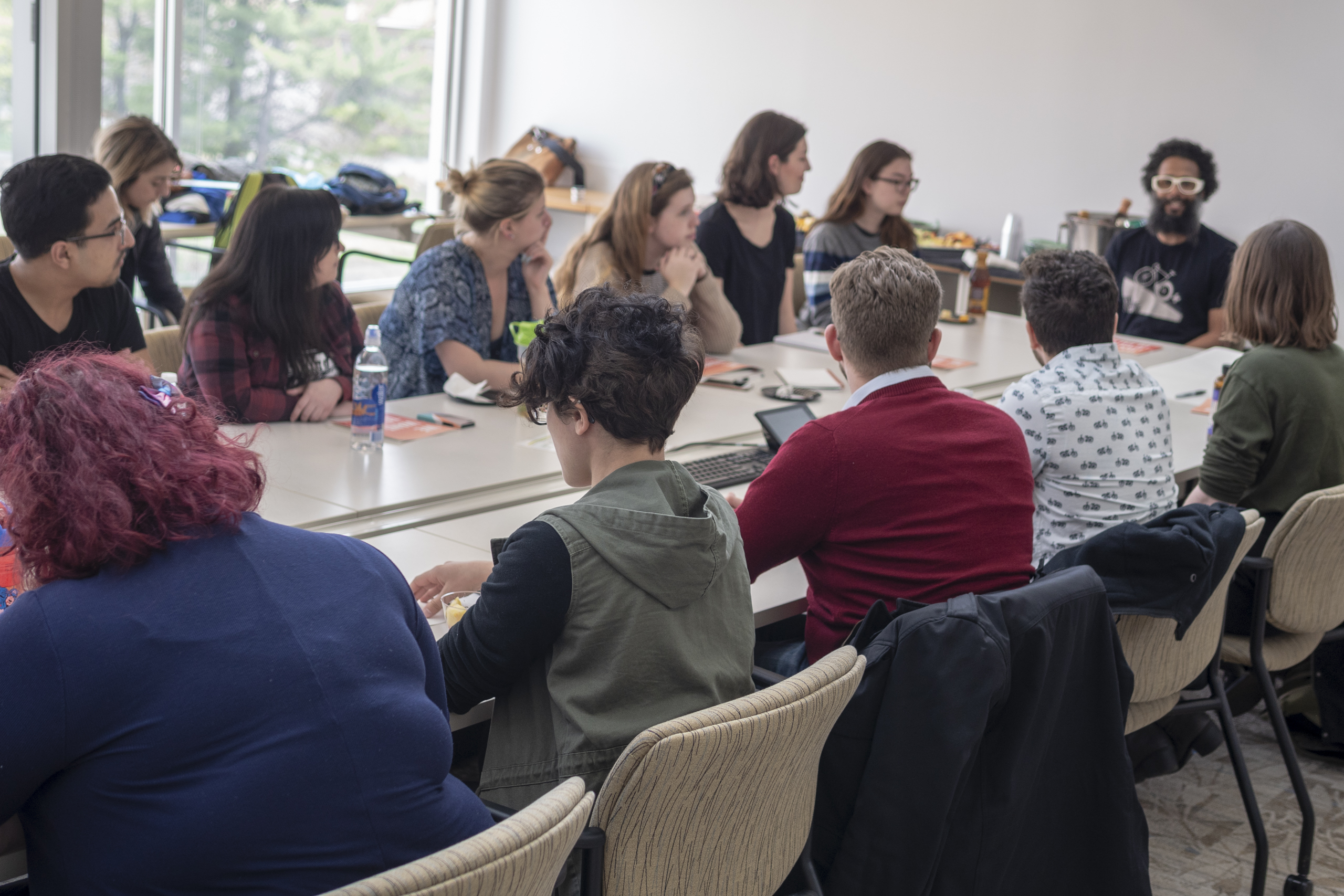
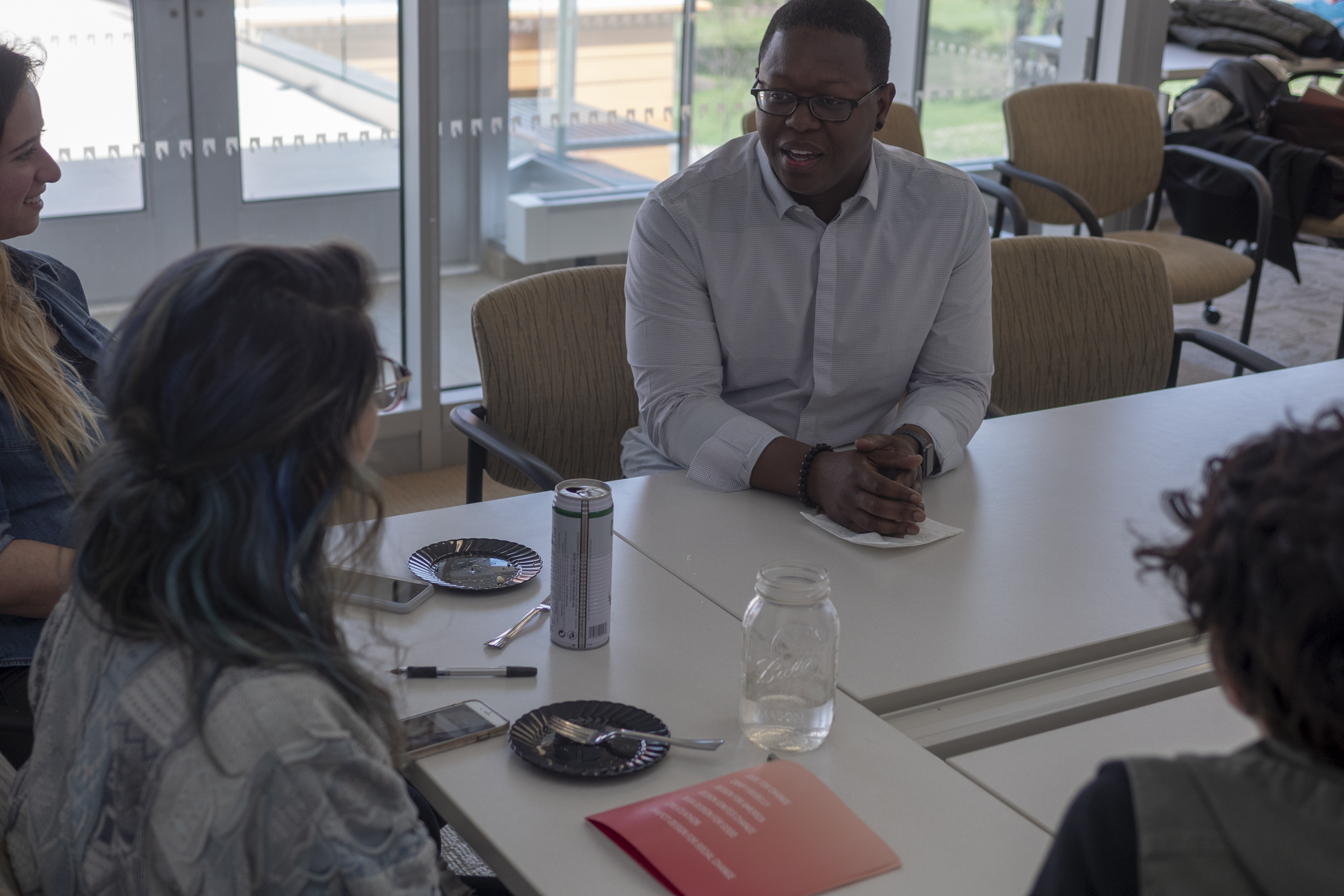
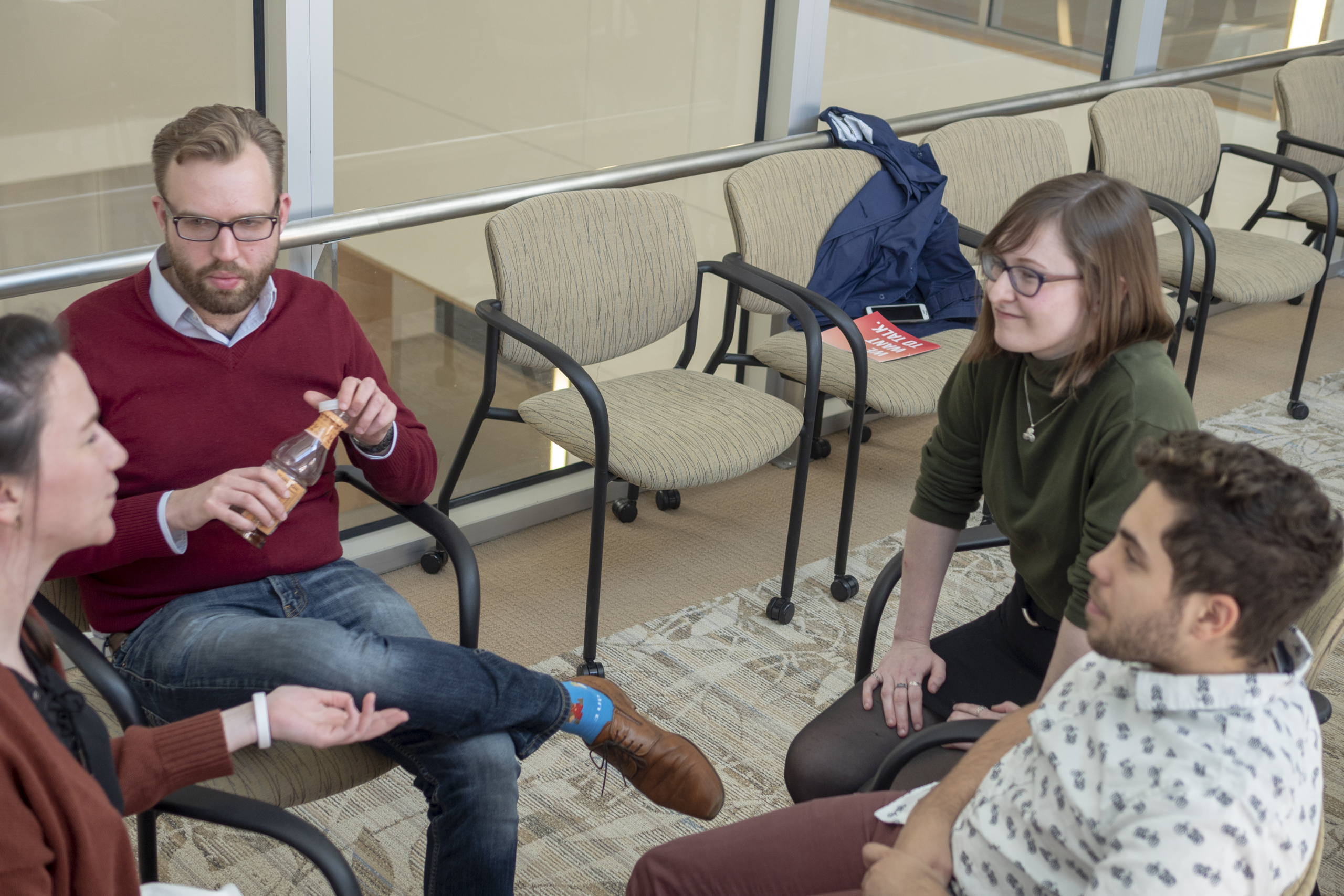
Project: We Want to Talk
Student: Rachel Benoit
Class: Thesis II
Rachel writes: “We Want to Talk is a workshop/discussion that brings together students and practicing professionals to create a dialogue about non-profit organizations, projects, and design firms that are rooted in design for good.Through this discussion participants will learn what they can do to contribute to social justice organizations using the skills that they have as a designer. This workshop also aims to create long-lasting relationships between designers and socially conscious design thinking/practices.’
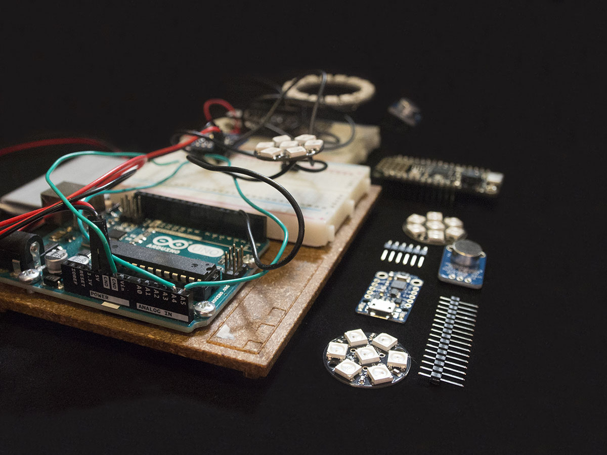
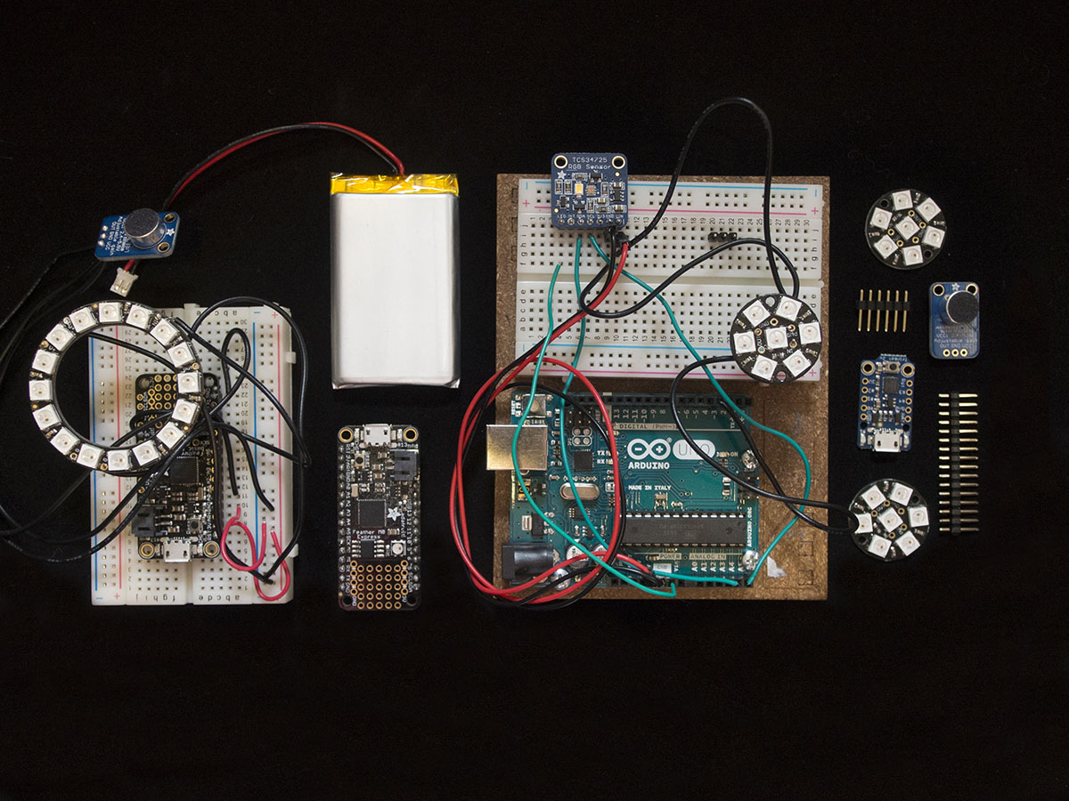
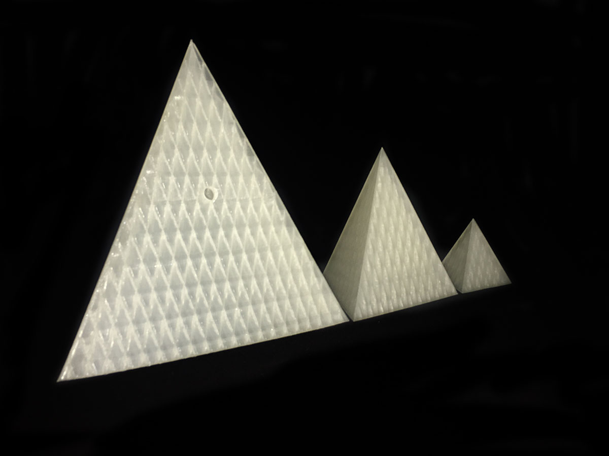
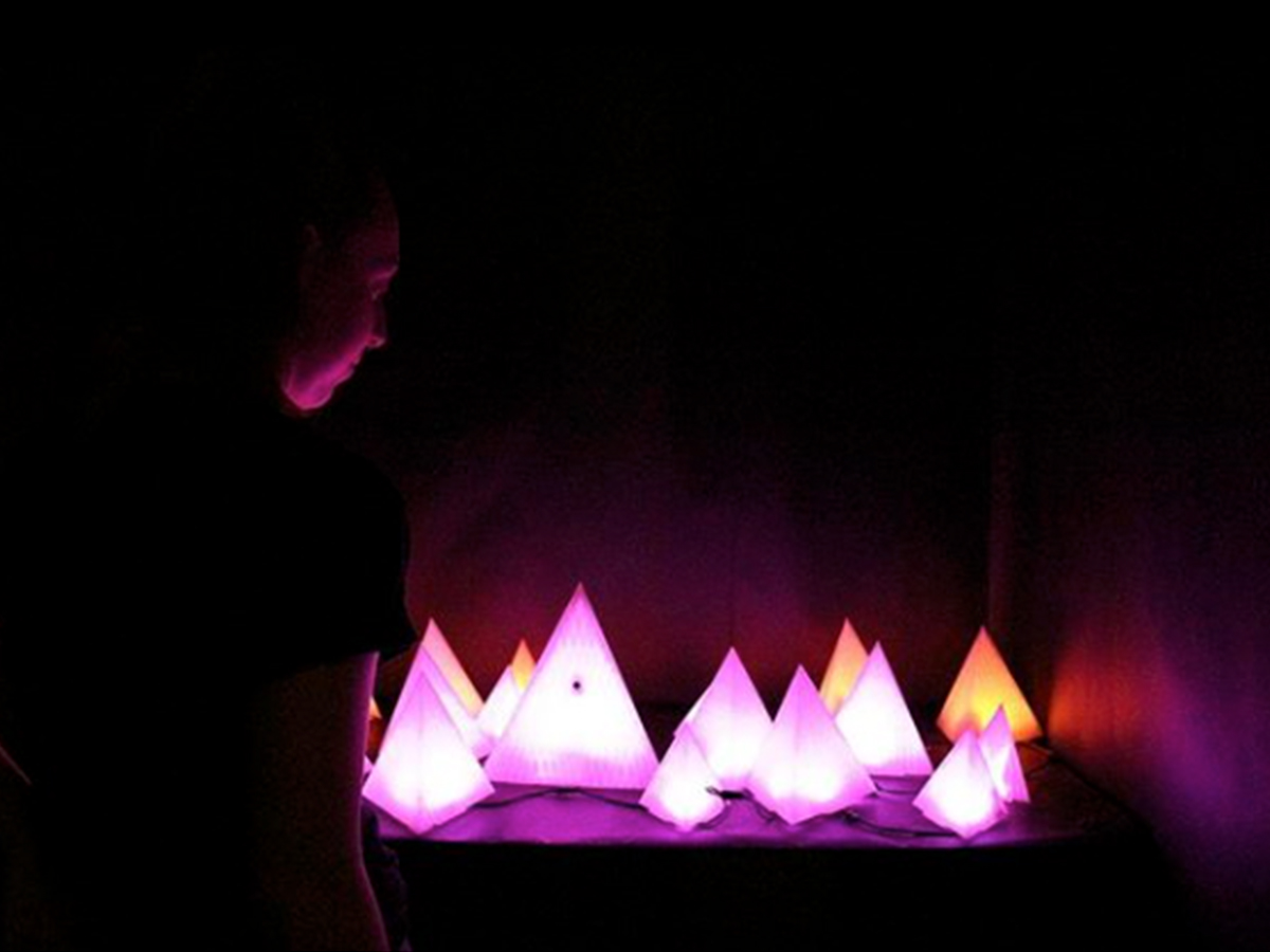
Project: Chromaesthesia
Student: Sam Eberle
Class: Thesis II
Sam writes: “Chromaesthesia is an interactive audiovisual installation inspired by the sensory condition known as synesthesia. Focused on the blending of color and sound, the installation aims to create a unique sensory experience for every individual. I wanted to explore how color and sound connect with one another, and the interplay of exchange individuals have with the combination of these two senses. Utilizing innovative tools such as mechatronics and 3D printing, Chromaesthesia was created. Aside from the installation itself, the project also includes a web presence showcasing an interactive map for people to view the colors individuals are hearing in their respective city. This allows the installation to grow through purchasing a pyramid to add to the piece and in return receiving a personal pyramid to keep as their own. This allows Chromaesthesia to have a larger interactive audience than just a colorful yet one-note installation. I wanted to produce a new way of experiencing sound and color, pushing the sensory boundaries for people to explore in an innovative way. Integrating graphic design and digital fabrication, Chromaesthesia exemplifies the exploration and blending of the senses.”

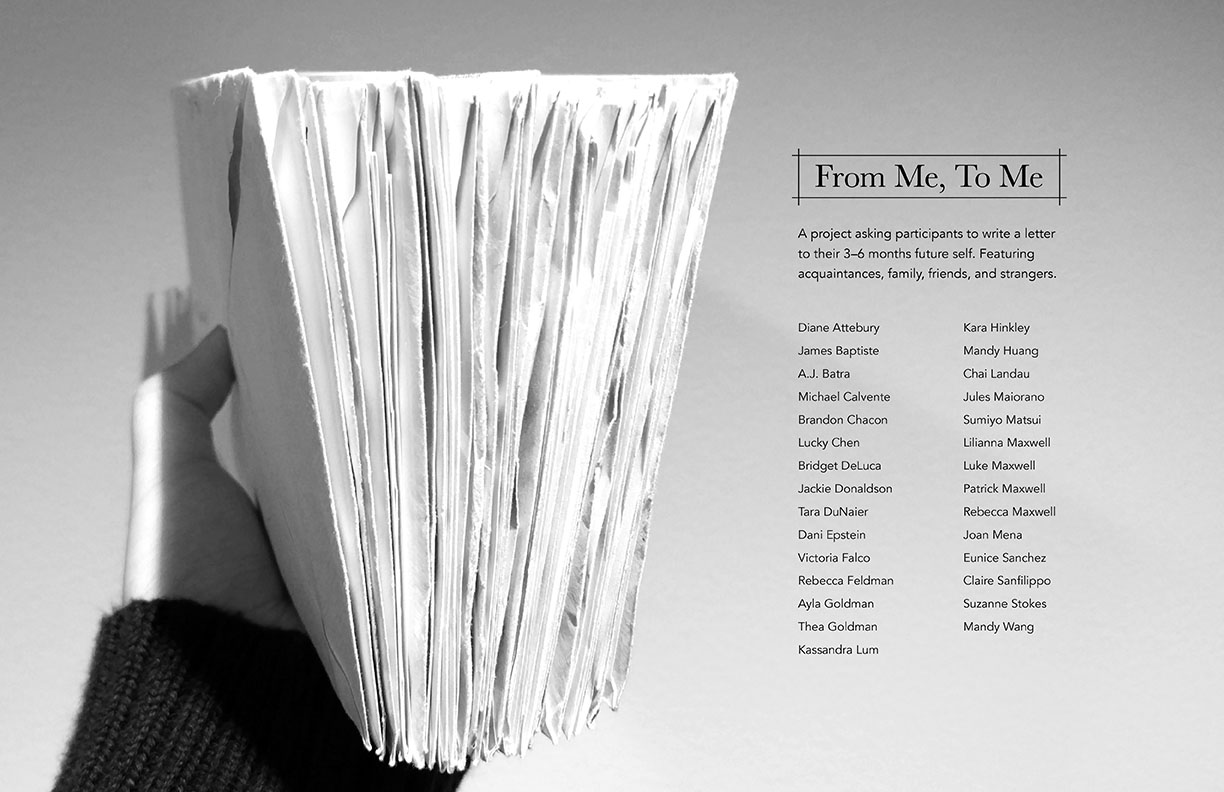
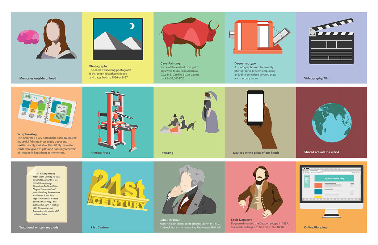
Project: Unbound by Time
Student: Yuan Chen
Class: Thesis II
Student: Yuan Chen
Class: Thesis II
Yuan writes: “How often do you reflect on your life? For many of us, it’s a hassle to slow down and step back from our perpetually overloaded days. Yet, we are habitually tracking the state of our well-being in one form or another as a means to look back to a certain moment. This could be in the form of diary entries, photographs, videos, sound recordings, social media posts, etc. In my thesis, Unbound by Time, I seek to familiarize my audience with both the contemporary and historical methods of recording life. My project aims to show an understanding on the purpose of recorded memory, how the practice has changed or stayed the same over time. It is my desire to encourage people of all ages to document and implement mindful self-reflection into their daily lives. Unbound by Time is comprised of a series of videos, a website, and a written letter project featuring acquaintances, family, friends, and strangers.”
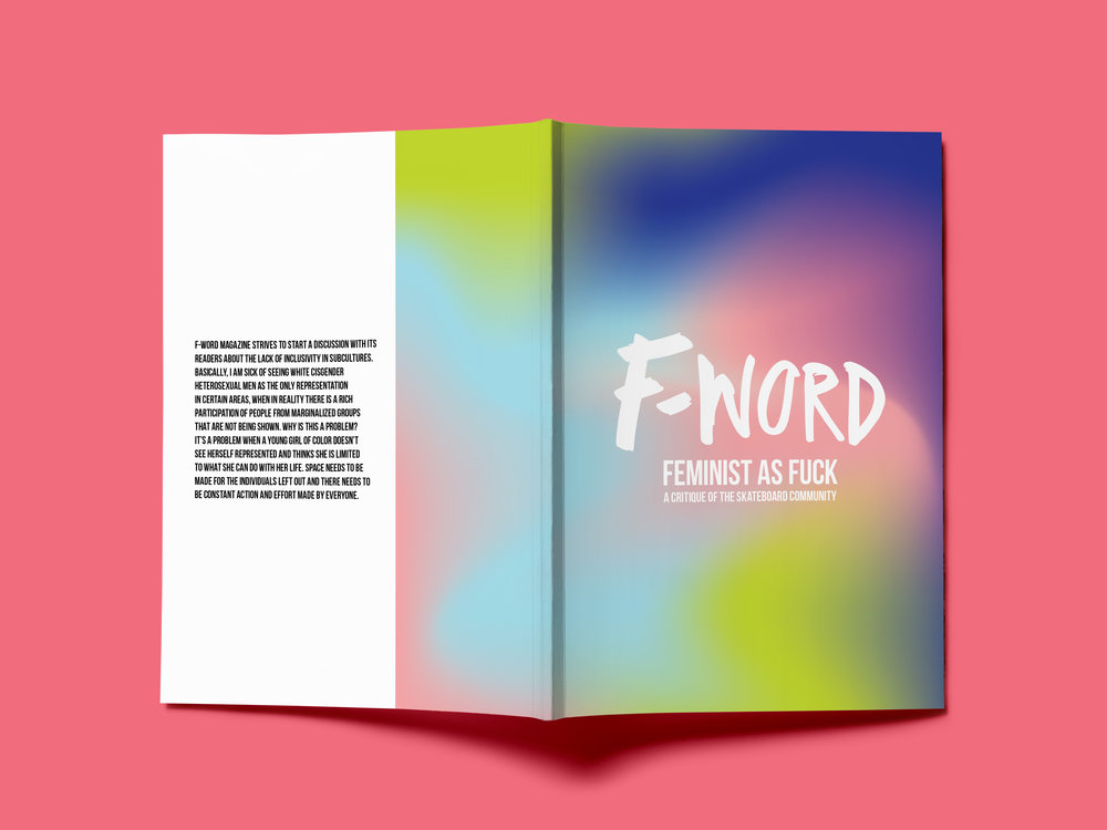
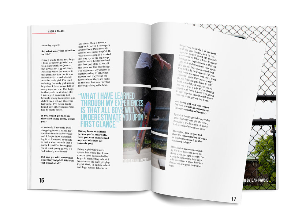
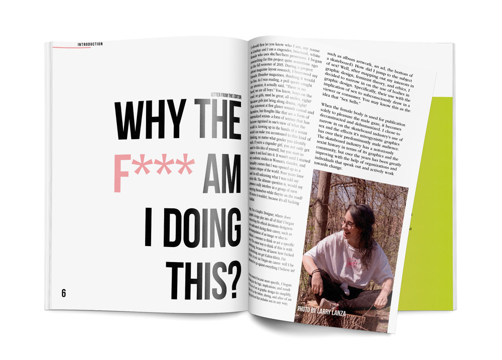

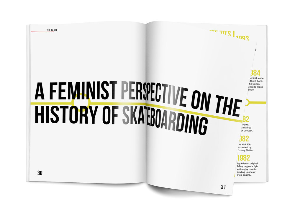
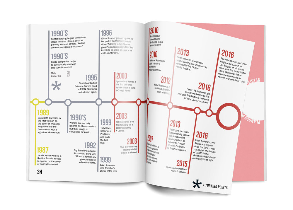
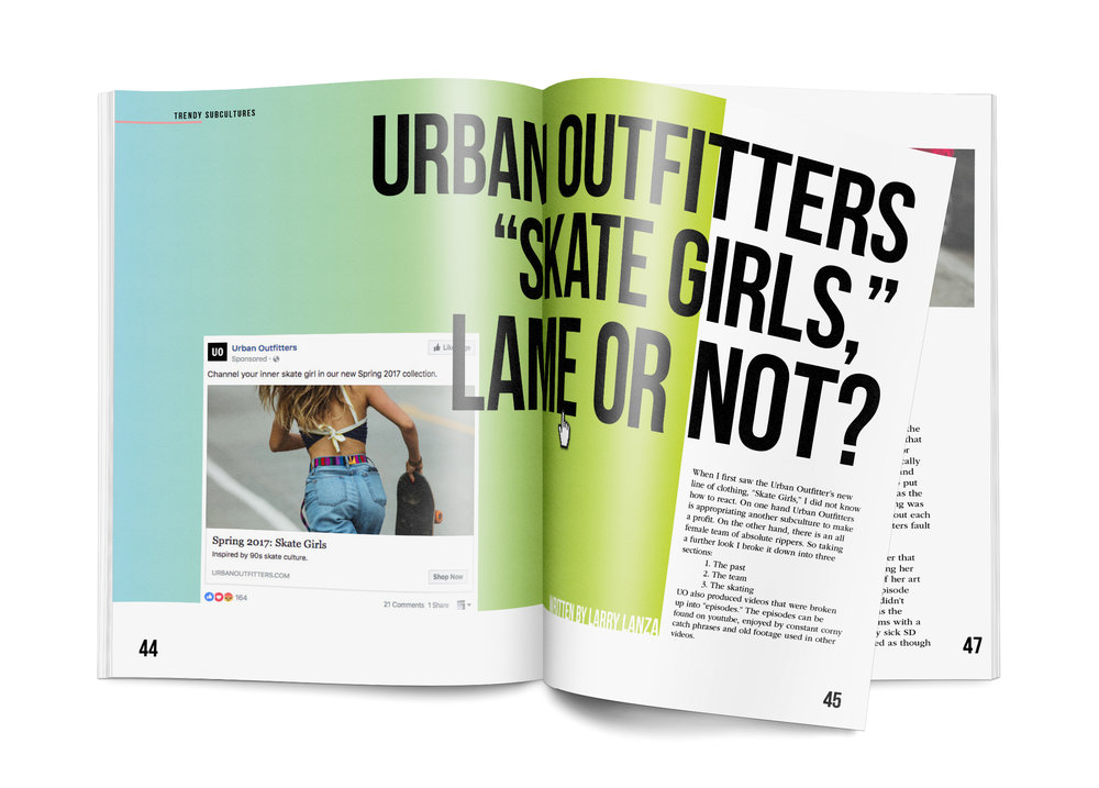
Project: F-Word
Student: Lindsay Brett
Class: Thesis II
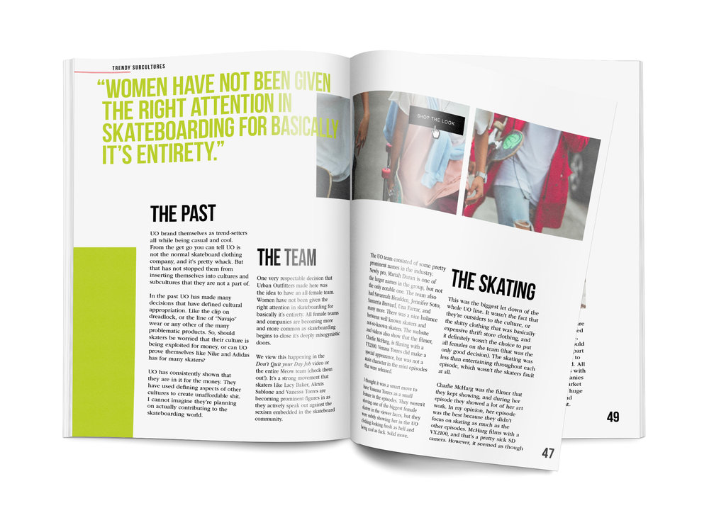
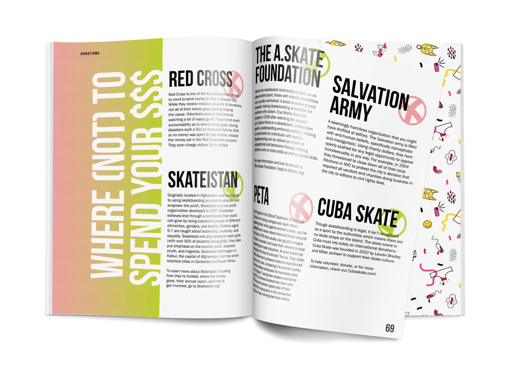
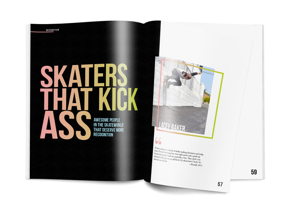
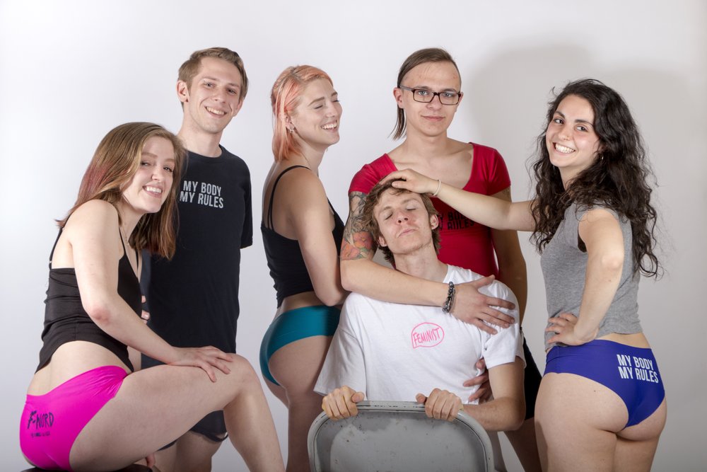
To describe her thesis project Lindsay writes: “F-Word strives to start a discussion about the lack of inclusivity in subcultures. Basically, I am sick of seeing white cisgender heterosexual men as the only representation in certain areas, when in reality there is a rich participation of people from marginalized groups that are not being shown. Why is this a problem? It’s a problem when a young girl of color doesn’t see herself represented and thinks she is limited to what she can do with her life. I chose to explain this problem by narrowing in on one specific subculture: the skateboard community. Space needs to be made for the individuals left out and there needs to be constant action and effort made by everyone. F-Word is a feminist skateboard brand that uses its magazine, merchandise, and skateboard decks to both criticize the skateboard community and empower those in marginalized groups.”

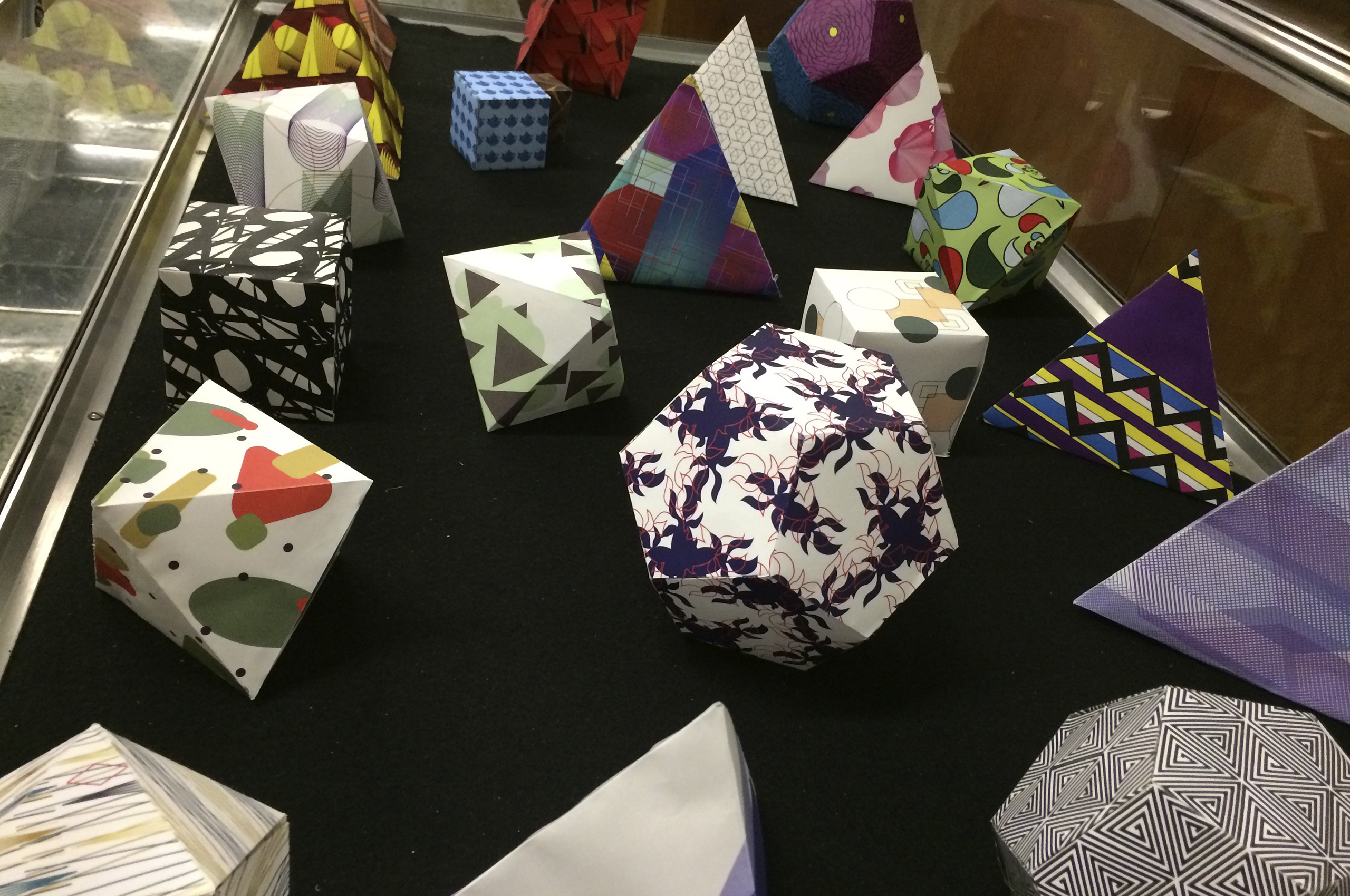
Project: Platonic SolidsClass: Graphic Design
Students begin by creating geometric and organiz paterns, they continue by constructing a 3 dimensional version for each of your patterns using the following platonic solids: tetrahedron, hexahedron, octahedron, dodecahedron, icosahedron. They are encouraged to consider if a the level of detail in one pattern is more appropriate for an object with fewer, larger faces (tetrahedron) or larger in number, smaller faces.
Project: Regarding the Pain of Others
Student: Yuan Chen
Class: Interaction Design
Student: Yuan Chen
Class: Interaction Design
Students were aked to prepare a visual and written response to one of the assigned readings (”Letter from Birmingham Jail” by Martin Luther King Jr., “Against Joie de Vivre” by Phillip Lopate, “Consider the Lobster” by David Foster Wallace, “Regarding the Pain of Others” by Susan Sontag, “Death of a Moth” by Virginia Wolfe in the form of an experimental digital narrative for the screen.
Project: Shape and Sound
Student: Johanna Turano
Class: Motion Design
Student: Johanna Turano
Class: Motion Design
Animation created early in the semester to explore timing animations to sound.
Project: Shape and Sound
Student: Luke Barnell
Class: Motion Design
Student: Luke Barnell
Class: Motion Design
Animation created early in the semester to explore timing animations to sound.
Project: Type Specimen
Student: Emma Seager
Class: Motion Design
Student: Emma Seager
Class: Motion Design
An mid-semester animation that showcases a typeface of the student’s choice, an animated type speciment.
Project: Branding & Motion
Student: Amy Zheng
Class: Motion Design
Student: Amy Zheng
Class: Motion Design
Students were asked to design and animate a fictional identity.
© Dimitry Tetin, 2023 LinkedIn